Oct 21, 2009

No stamping required!

Sometimes, it is nice to do a card that doesn't require any stamping. Particularly when you're doing 32 of said card. I'm going to a fire wife baby shower this weekend. Yes, another one! If you're trying to figure out the count, we're at 11 in 20 months. Yep, 11 babies and toddlers running loose at this year's Christmas party. Should be a blast.

What started off as a cry for help, to add a little pizazz to the invitation that had already been started, quickly became a complete redo. I wish I had taken a picture of the original. It had potential, but it did need something. After some discussion about ways that we could pump up the design, Kara asked if it would just be easier to start from scratch. Since I had a package of pink baby paper I'd bought to make thank you cards for The Girl, I assured her that not only could we easily do up a new design, we could do it without buying anything.

Shower Cards


Shower Card 3Let me take a moment to talk about the Cricut Design Studio software. I know people rave about Sure Cuts A Lot, but I've been extremely happy with the rather basic package Provo Craft put together. That's not saying it couldn't use a dramatic upgrade in the features department! That being said, I really like the flexibility it gives me with the standard cartridges. I literally do not make a cut with my machine without it. The paper savings alone makes it worth while! I love being able to weld my shadows and maximize my cuts. This job was no exception. I broke out the Cricut Expression machine I got for Christmas (h'ray for Black Friday sales!), and a 12x24" mat. With one mat and two sheets of cardstock, I was able to cut 90% of the darling little dresses. Another run through got the white shadows. Once more through with got the rest. So three times through the Cricut with a 12x24 mat and I had the makings of 32 baby shower invites.

Shower Card 2When doing that many cards, mass production is the best way. I printed the details on white cardstock we used as the card base. That is layered with a pink paper, followed by the baby dresses. To give the cards a little bling, I ran the flowers through my Xyron 150 (the little X one) and added glitter. Another thing you need to be aware of when doing invites or cards that need to go through the mail is to keep your bulky embellishments to a minimum. Simple can have lots of great impact.


Project SuppliesThis was a super simple set of cards. Just cardstock, glitter and six sheets of patterned paper. The cardstock is American Crafts, Georgia Pacific and Prism. The glitter is from Art Institue and I haven't a clue who makes the patterned paper. I bought a bulk pack of it at Dollar General when I was making thank you cards for Linsey's baby shower. I used the New Arrival Cricut Cartridge for the cute little baby dress.

Sep 27, 2009

Back from Blogcation!

I know, I know, it's been forever since I blogged. I took a much needed blogcation. (laughing) Between stress of hunting up a new job (no luck there yet) and learning to cope with suddenly becoming a stay at home mom for a while, I decided the blog would get the short end of my attention span.

While I haven't blogged, it doesn't mean I haven't done other things. In fact, I've done lots. I find coloring and cardmaking to be quite relaxing. Let's start with a card I did up for Becky over at Page Maps. She buzzed me back in July asking if I'd do up a sketch for her September card maps. Of course I said "absolutely!"

SketchIt was a fun sketch, but a bit challenging for me. I took several stabs at it, trying to stay true to what Becky had drawn. It just wasn't working for me. First off, I just don't put sentiments on the front of my cards. It's not laziness, I simply don't like confining my cards to a simple statement. That way I end up with a fine stash of blank note cards ready for whatever I need at any given moment. I can always add one to the front later if I choose, although to be honest, they nearly always go on the inside. Once I let go of the sentiment, the card just fell together!

Hi There! Even though I'm a huge tool junkie, I've just never been a big fan of punches. This includes border punches. It means I have to be doubly creative when I want things like a cute mini scallop border on one side of some patterned paper. Nestabilities to the rescue! I cut my patterned paper and black mat to size, then lined up the patterned paper, centered on top of the mat while keeping it lined up on the edge I was going to cut. Then I ran them both through with one of my long rectangle scallop dies. when I separate the two layers, I have perfectly lined up scallops on the paper and the mat.

The image is called Peek A Bunny. It's an Elisabeth Bell image from Sugar Nellie, courtesy of Funky Kits. It will make for a cute "Hi" or "Thinking of you" card. I always have a need for those. You'll notice that I filled the orientation of the sketch and made the scallops for the sentiment go all the way across. The card felt more balanced to me this way. A few dew drops and some ribbon finished it off.

Project SuppliesThe paper is BasicGrey from the Urban Prairie mini stack. I love those little 6x6 paper stacks. They're perfect for cardmaking, leaving me little to no scraps left over to feel guilty about dumping in the recycle bin. I use rectangle nestabilities here, all in rectangles. The image and mat are done with the regular sized rectangles and matching scallops while the outer piece was done with the long rectangle scallops. The cardstock is American Crafts, ribbon is Ribbon FX from Hobby Lobby and the dots are Dew Drops. The image was colored on PaperTrey Ink's Rustic White with Prismacolors and blended out with Zest It. Becky has some great card maps available this month. Be sure to stop and check them out!

Aug 11, 2009

The Abbey Road less traveled

Christmas is my favorite of all the holidays. I can't wait to put up the tree, pull out the decorations and cover our house in snow themed decorations. Oddly, my obsession with Christmas does not extend to Christmas themed scrap papers. This is mostly because the Christmas themed papers are so overly...well...Christmas. The last Chistmas papers I bought were Prima and I ended up using them to make a Halloween layout. I'm not sure how that works out in the scheme of things.

All that being said, I tend to do my Christmas layouts on anything but Christmas papers. I look for papers that suit my photos, or rather photos that suit my papers. When I pulled out the Bo Bunny Abbey Road papers to work on recently, the first photos I thought of were ones I had been going through a few days earlier. The photos are of my daughter, who at just shy of three in these photos, shares her Mama's love of Christmas. Between pregnancy and travel, this was the first year in several that I'd put up a tree. Even though I barricaded myself and the tree away from the kids in order to get the decorating done, it didn't last. As you can see, I relented to a pair of big blue eyes and let a little girl hang a few ornaments on the tree. The title says it all. She was simply enchanted.

Enchanted


The photo on the left is a 5x7, while the ones on the right are wallets. This is a simple layout, using only one sheet of patterned paper, in contrast to the three or more different patterns I tend to prefer. I made up for the lack of patterned paper by using three different colors of cardstock. I did the center pieces of this layout and tried it on several very dark tones before finally settling on the lighter putty tone for the background. I'm finding that my layouts lately use a lot of white space around photo area. I was really wishing my LSS had a better selection of Bo Bunny double dot cardstock when I was putting this one together. The subtle dot pattern would have been a great accent in the background.

I glittered the letters with pale green Art Institute glitter, mounted the stickers on cardstock and then on pop dots to give a bit of extra dimension. The ribbon is more of the Wrights Binding Tape.

ReflectiveEven with all the paper I used on the layout, I still had enough left over for a quick card. This time, I got extra impact by pairing it with a dark chocolate cardstock. I colored up one of my favorite Elisabeth Bell images from Funky Kits called Reflective. I used prismacolor pencils and blended it out with Zest-It. The image was stamped on PaperTrey Ink's oh so yummy Rustic White cardstock. I kept the card simple, rounding the corners with my spiffy new We R Memory Keepers Corner Chomper (seriously awesome tool!) and finished it off with a bit more of the brown hem binding tape from Wrights.

I tend to leave the sentiments for the inside of my cards unless I have a specific person/event in mind when I make them. This one is destined to be a "thinking of you" card, or a nice thank you card. Either sentiment suits the image quite well.

Project SuppliesSupplies are simple this time. Prism cardstock, Wrights hem binding tape, Bo Bunny Abbey Road paper and stickers. Not a button in sight and nothing from the Creative Cafe. Simply amazing! :)

Aug 5, 2009

Blast from the not too distant past

One of my goals while I'm being just a mom is to clean out the disaster area of desk. I look back there and while it doesn't feel like I'm making any progress, I know I am. There's definite evidence...like the clear path from the door to the desk that was previously small, uncomfortably positioned stepping stones. Not only that, I keep finding things. Finding things is always good, like this layout...

cheyenne mountain zoo


Four years ago, I found out that after 12 years of trying, I was pregnant. I was excited. I was thrilled! I was also sick, but that just comes with the package. Our vacation that year came along when I was 8 weeks pregnant. On that trip, we visited my parents, the Fire-Rescue International Expo and Cheyenne Mountain Zoo. I love zoos and try to plan one into a trip as often as possible. Cheyenne Mountain is in Colorado Springs, Co and is one of the prettiest zoos I've been to. It's on the side of a mountain and the zoo follows the ups and downs that come along with that. Through an accident of "let's climb the hill part first" decision, we didn't come on the giraffes until the very end of our explorations. It was the highlight of the zoo and I couldn't have planned the adventure any better.

Cheyenne Mountain has an impressively huge giraffe enclosure, with giraffes of all ages. But the really amazing part is that they let guests feed them. The upper tier is positioned to be the perfect height to stroke the velvety nose of the giraffe and experience first hand the incredibly long tongue! If you ever happen to be in the area, I highly recommend a visit to their zoo. Take the high road first, the giraffes are totally worth the wait.

Project SuppliesSupplies here...more BoBunny. I believe this line was called Fall Festival, or something similar. I fell in love with it and bought twice what I normally would have purchased. This is from the time when Bo Bunny did paper weight stock, so it's great for altered projects. I'm thinking it might grace a fall wreath sometime in the near future. The title is done with the Cricut, one of my first after that purchase. The font is Stamped. I remember working with scraps and the "set paper size" function on the Cricut to get the most out of my single sheets of matching cardstock.

Jul 31, 2009

Christmas Dustin Style

treed bear cardI'm one of those Christmas nut cases that decorate their house following a specific theme. I love the sparkling whites and blues and the oodles of snow themed decorations. None of today's projects fall within that theme. :) So, let's start with a card. As soon as I saw this image in this week's collection from Dustin, I knew I would use it. It fit well with my sense of humor and I can easily see sending it out to a friend during the holiday season. Since I had my BoBunny paper bin out, I pulled out their Classic Christmas papers from a couple of years ago. Decorating with a theme doesn't necessarily mean I don't horde Christmas papers in traditional colors.

In addition to being psychotic about my decorations, I also wrap packages with real ribbon bows, tying on gift tags rather than using the prepackaged flimsy tags that are sold in stores. I love making personal gift tags for each package. I think that makes the gifts just that much more special, not to mention looking really cool when they're stacked under the tree. They're also great to tie onto gift bags as an added embellishment.

trio of gift tags

These tags are 3" x 3 1/2" with a hole punched in one corner for the ribbon. For package use, I would use the bit of ribbon to tie the tag to the package or bag. The images were printed at actual size for these tags. I've also done smaller tags that are 2 1/4 x 2 1/8. Those are done by taking a quarter sheet of standard 8 1/2 x 11 cardstock and cutting it in half, then folding that in half again. Quick easy cutting measurements. For those, you'll want to size the images down, perhaps using the more simplified ornament peekers that Dustin has released this month.

Project SuppliesSupplies this time around are pretty cut and dry. I used BoBunny Classic Christmas papers. These are a couple of seasons old, but I wouldn't be surprised if you couldn't find them with a bit of searching on the internet. The ribbon is also from the Classic Christimas collection. I also used Bazzill cardstock and a few different Spellbinders Nestibilities. Check out Dustin's new release for this week and don't forget to stock up on the Christmas images he's released the rest of the month.

Jul 27, 2009

I hope you dance

How do I go from a directory of digital photos to a finished layout? My process is pretty simple. I frequently start by deciding what paper I want to use. I know this is the reverse from most people. Paper inspires me, though. Once I have paper picked out, I go hunting for a sketch that I think will go well with the patterns on the paper. My sketches come from either something I've found online, or one I've drawn myself. I get inspiration for my sketches from magazines and layouts I've seen in galleries or blogs online. My sketches tend to be more basic than the ones you might find at Page Maps or one of the other sketch places online. They're more of a reminder of the initial inspiration than a true map.

Once I have my paper and sketch, I decide what photos from my files will work best. Usually, I have several options to choose from. I pick my favorites that seem to suit the paper the best and print those. I usually print my favorite photo as a 5x7 to serve as the focal point of my layout. The others get printed as 4x6 or wallet size. Don't be afraid to choose several sizes!

At this point, it's usually a matter of just putting everything together. Every once in a while, however, it just doesn't work. When that happens, I struggle. I spend ages trying to "fix" the problem. That's what happened when I started working with these photos. The paper, Bobunny Alissa, I felt was perfect for the photos. My problem was in the sketch. I had done something I never do. I had tied myself to a sketch, so much so that I even spent time in the Cricut Design Studio recreating the side element. I use sketches as a jumping off point, more inspiration than map. The linear design of the sketch became limiting and stifled the flow of the pictures. I couldn't find the unbridled delight of my daughter dancing in the design, so I stopped. I put the layout aside and worked on a different group of photos.

When I went back to the layout, I saw how stifling the design was and set to work trying to salvage what I could of the paper and photos. In the long run, it was mostly a lost cause. My photos ended up stuck to one another and the paper had been cut in long lines, which doesn't salvage well. The only thing I managed to save was the base cardstock, which was a nice chocolate brown and the pink letters I had cut for the title. I tucked the brown cardstock away for another project. The only thing that remains from the original layout is the pink letters.

Balallet

I think you'll agree that this layout works very well with the photos. I like the airy feel of white space in the layout paired with the illusion of movement the circles give. I managed all four circled and mats with a single sheet each of the papers. The pink mats are just rings on the back sides of the solid blue circles. This let me do the mats, the lettering and the journaling block with a strip of paper left over.

PhotobucketWhen it came to embellishing, I wanted something that would add to the light feel of the layout without overwhelming it. I bought a pack of acrylic Bobunny swirls a few months ago as an impulse buy. I wasn't sure what I would do with them. I thought they would be perfect and was fairly happy with the effect when I placed them on the layout. I thought they still needed something however as they seemed to fade into the background. Pink glitter did the trick. I used Making Memories Glitter Glaze to coat one side of the acrylic swirl and dumped on a thin coat of Art Institute Pink Glitter. The glitter gave me the pop I needed while keeping the swirls from being too heavy for the overall feel of the layout.

For those of you who prefer single page layouts, here's a close up of the left side. You'll notice that even though the horizontal bars in the double page layout tie the to pages together, they can be a simple stand alone element in a single page layout.

balallet left

This little moment happened when my parents came to visit back in April. They brought with them a leotard and skirt. My daughter was in heaven. She loves to dance, and ballet is a favorite. She would pull on her the skirt from her Halloween fairy costume and do "balallet". I thought that using my daughter's word for Ballet was the perfect finishing touch.

Project SuppliesSupplies for this layout are primarily BoBunny. I really love their papers. Such diversity and charm! This is from the Alissa line. I used my EK Success circle cutting system for the jumbo circles, BoBunny acrylic swirls and Art Institute Glitter. The title is the Alphalicious font for the Cricut with the fun chaotic styling on the shadow done in the Design Studio. More BoBunny coming up in future posts. I found a layout from when I first got my cricut while I was doing some cleaning. It's a fun, no kid layout, so stay tuned.

Jul 18, 2009

Packing my bag...

Dutch Girl Backpack front sideWith chocolate and good wishes. I don't know if you have noticed or not, but it's been over 2 weeks since my last blog post. It's been a roller coaster of a month so far, but things are getting better. You see, on July 1st at 1:30pm, I was knocked off my feet. I was informed that my company was moving to a new eCommerce model and my position and skills were no longer needed. I think that's a ongoing thing in this world today. It's difficult and frustrating and there's not a dang thing you can do about it. I floundered for a bit, as would anyone in my position. I lost my center, my balance.

It's taken me a while to find it again and find me. Sometimes I'm harder to find than my center, but in this case it was the other way around. I've got an awesome husband who reassured me that this too will pass and a firm faith in the Big Guy that through him I can do all things. So I've put myself on the market, sent out resumes and cover letters and, frankly, I'm seriously looking forward to being just a Mama for a while. We have a game plan that is already in place and kicking. As of Friday, well...I have a bit more time on my hands. Although, wrangling kids is as much of a full time job as the wrangling cats (programmers & designers). Oddly, dealing with programmers has been excellent training for dealing with 3 year olds. :)

Dutch Girl Backpack side 2So I've packed my bag with chocolate and good wishes. It's a pretty cute little bag, don't you think? I used a template from Splitcoast Stampers and Cosmo Cricket Dutch Girl. It's my first go at this particular template, but I quite like how it turned out. Next time I will tweak it a bit to suit me more. I think that the flaps are a bit overwhelming and can be scaled back. Folding and cutting was pretty straight forward. I found that it worked best for me to print out the template and attach it to my patterned paper with the Herma dot repositionable adhesive. Once stuck together, I could trim it out and score all the lines without any guess work.

After everything was trimmed and scored, I removed the paper, scrubbed off the dots and started assembly. My beloved Crop-A-Dile came into play to punch all the holes, however, I wasn't able to use it for the eyelets on the top flap. It just couldn't get into that spot for crimping. I ended up digging out my old Making Memories took kit for my manual eyelet setter.

Dutch Girl Backpack sideI have a small collection of Wrights hem binding tape. I like the bold vivid colors, but the Wrights brand tends to be a bit stiffer out of the package than I care for. When I got to restock, I'm going to be hitting etsy as I've found several places there that sell bulk tapes that are silkier and softer. Still, Wrights is handy and you can pick it up in the fabric notion section of Jo Ann's, Wal-Mart (if they have a fabric section) and Hancocks. So lots of local sources. On a positive note, the stiffness really worked well when I gathered it and tucked it behind the flower button.

Project SuppliesI've pretty well covered all the supplies in the post, but here's a recap. The paper is Cosmo Cricket Dutch Girl, the last in my Cosmo Cricket run for a while. The ribbon is Wright's Hem Binding Tape, but eyelets are Making Memories while the button is (gasp) Creative Cafe. Seriously, if you have a Creative Cafe store near you, go play with their buttons. The butterfly is also Creative Cafe, from their new release. I've been waiting forever for these cute felt flutters!

Jul 1, 2009

Take Note!

One of the things I have discovered as I get older is that I have a growing dependence on lists. If I don't write it down, I don't remember it. It's like the act of writing something down logs it into my memory. I don't go shopping without a list. It is a complete disaster. If an item is not on the list, it doesn't get bought. That being said, as a paper crafter, I have an obligation, to myself at least, to not go out into the world with a shabby note pad. Since I rarely create things for myself, when I do, I tend to go a bit overboard.

notebook front viewIn the past, I would just buy a notebook of the size I needed dress it up. This time, I decided to go out on a limb and make one from scratch. I have a Bind-It All that I got for Christmas that I hadn't used yet, so I figured it was high time to put it to use. I picked up a junior legal pad and proceeded to take my heavy duty Tonic Studios craft knife and cut it down to 4 1/2 x 5. This takes a bit of muscle and a lot of patience to keep the edges straight. Once I get the pages and back cover cut down, I run it all through the Bind-it All. I have decided that this handy dandy piece of hardware is one of my new best friends.

I divided my pages up into sections and fed them through the Bind-It All. I used a single sheet, folded in half as my initial centering point and set the guide on the side so that all my holes would line up. After I did the pages, I did the back cover. I used the thick chipboard back off the notepad. I figured it would hold up well to the wear and tear the notepad was going to get from being chunked into my purse. After the base and the pages were punched, I decided the bottom corners needed to be rounded for a more finished look. I pulled out my other new very best friend, the Crop-A-Dile Corner Chomper. This little beauty rounded the corners of the super thick base chipboard without even flinching.

notebook side viewBecause I wanted durability for the cover as well as the base, I knew just covering chipboard would not give me the results I wanted. After some thought, I pulled out a sheet of grungeboard. Now there are lots of wonderful things you can do with Grungeboard, but I didn't do any of them. Instead, I used it as a base for my cover. I wallpapered over it with Cosmo Cricket's Girl Friday papers. I used a dry glue to preserve the flexibility the grungeboard was bringing to the cover. I like Kokuyo Dot'n'Roller permanent. It stands up to all sorts of abuse. I regularly use it on altered projects and have never had anything glued together with it, come apart. Just make sure you get adhesive out on the very edge of your paper.

While I liked the look of just the Cosmo Cricket papers on the front, I wanted it to be a bit more...girly. I added one of my favorite stamp images from Sugar Nellie, Windswept by Elisabeth Bell. She's done on PTI Rustic Vanilla. I love how vibrant she came out. She was sitting in a pile of images I had colored a couple of weeks ago and just happened to match the colors in Girl Friday. I trimmed her out with Labels 3 Nestie and mounted her on a black tag I had in my stash.

It still wasn't quite girly enough for me. I dug out my stash of Prima Say it with Crystals (and pearls!) swirls. They didn't fit like I wanted, so I took a pair of scissors to the pearls. I trimmed off the bottom of the swirl and relocated some of the strings of small pearls until everything fit like I wanted. I finished off the front with a new Creative Cafe felt butterfly and a bow I found when I was digging for the pearls. I love unexpected finds and my craft area is loaded with them!

I punched the cover and after some muttering at the micro size of the photos in my Bind-it All instruction manual, managed to get it all bound. The rings are "quite" round, but round enough that the cover moves freely. A bit of ribbon tied along the top adds a bit more girly fluff and pulls it all together.

Project SuppliesI've pretty much covered the supplies list through the post, but here's a quick recap. The paper is Girl Friday from Cosmo Cricket, the stamp is from Sugar Nellie, the cover is Tim Holtz Grungeboard. Tools used are the Bind-it All, We R Memory Keepers Corner Chomper, Spellbinders Nestibilities and Tonic Studios craft knife. Ribbon and tag are from my stash, while the pearl swirl is Prima. No buttons this time, but the butterfly is Creative Cafe.

Jun 30, 2009

Smile Mr. Campy

You didn't think I'd given up scrapbooking for card making did you? I may have been a stamper and card maker before I ever found my way to scrapbooking and altered projects, but I love all three paper crafts equally. So for a change of pace and to get back into a more versatile blogging format, I give you a scrap page.

With all the amazing paper companies out there, I have a couple tried and trues that no matter what they release, I seem to just love. I may not have a clue what I'm going to do with a particular line when they release it, but eventually I'll figure it out. Cosmo Cricket is one of those paper companies. I've loved them since their early releases, but it was Souvenir and then Wanted that really pulled me in. I never was able to find either in a store where I could stock up on it. I noticed they had Wanted in stock in the new online store setup, so I may have to get a few pieces soon.

These days as soon as my LSS gets the latest release, I do my best to stop in and snag my favorite pieces. I still miss things. I got Girl Friday, but missed Snorkel entirely through 3 restocks. They had not ordered in Early Bird when I stopped in today, but the owner was planning on ordering it this afternoon, so I still have a chance at it. I tend to OD a couple of times a year on Cosmo Cricket layouts and projects. Last year, I got lucky with my LSS kit club and I went nuts with Hello Sunshine. I ended up with two of my all time favorite projects out of it. The clear acrylic tag book and the This Man layout. My mom still carries the tag book everywhere with her, even though the pictures are well over a year old now.

Still, occasionally, I fall in love with paper and then spend forever deciding what I want to do with it. This was the case with Mr. Campy. I loved the colors and the awesome plaids and while I'm an in doors, what do you mean you left the microwave at home sort of camper, I figured, "heck, I've got a boy, I'll use this in no time." So it's been happily sitting in my stash gathering dust. Thankfully, I couldn't see the dust through the haze of my F5 Tornado-Ridden-Certified-Emergency-Disaster-Area of an office.

If you've stuck with me this long, you're probably wondering what the point of all this is. Well, it's it never judge a paper when you buy it. I was determined to put the paper to good use and the perfect pictures for the paper turned out to not be of my boy-o. A paper like Mr. Campy may be fantastic for outdoorsy, camping, boy pages, but that doesn't mean It can't be flat out great for little girl pages. Like this one -

Full smile layout with journaling.


Pretty cute, isn't she? She loves cameras, so she was over the moon I gave her my old junk Avantex one. The journaling reads "An old junk camera and a two year old makes for smiles on both sides of the lens."

Smile Title SideI've noticed a trend in my scrapbooking lately. While the majority of my layouts are unified two page layouts, I have one page of the pair that can comfortably stand alone. Check out the right side page by itself (prior to me adding the date!). There is even room to tuck in a bit of journaling. The page could also have easily gone masculine, just swap out the flowers for buttons. In this case, I probably would do trios of buttons in the same locations and changed the velvet scalloped ribbon to a twill in the same color tone.

Want to add some stamping? There's even areas that would work perfectly if you have the right image. I have a cute Penny Black image of some mice playing with a camera. That could be the perfect accent to the SMILE! title.

Project SuppliesThe supplies are pretty simple for this one. Mr. Campy papers from Cosmo Cricket, flowers from Prima and the buttons, of course, are Creative Cafe as is the velvet scalloped ribbon. The title and tag were done on the Cricut using the Design Studio software with the Alphalicious font and Tags, Bags & Boxes cartridges. Solid color cardstock is Prism and the twine is Rustic White from PTI.

Jun 29, 2009

Family Ties - Laced in Cosmo Cricket

Have you ever done a project and fallen in love with it, even though you knew you were going to give it away? Then, just past the half way point of being home after hand delivering said project, realized you forgot to take a single picture of it? So you figure, once you get home, you'll just call and have them snap some photos and email them to you? There in lies my lesson to you. Always, ALWAYS take your own photos. Seriously.

I am truely blessed to come from a family that loves hand made gifts. At least, they love mine. They rave about them, display them in prominent places in their home or at work and really suck at taking good photos of these projects. I adore my family, really I do, but I seriously need to work on their photography skills. That being said, between my mom and my sister, I have a fairly decent collection of photos of my project.

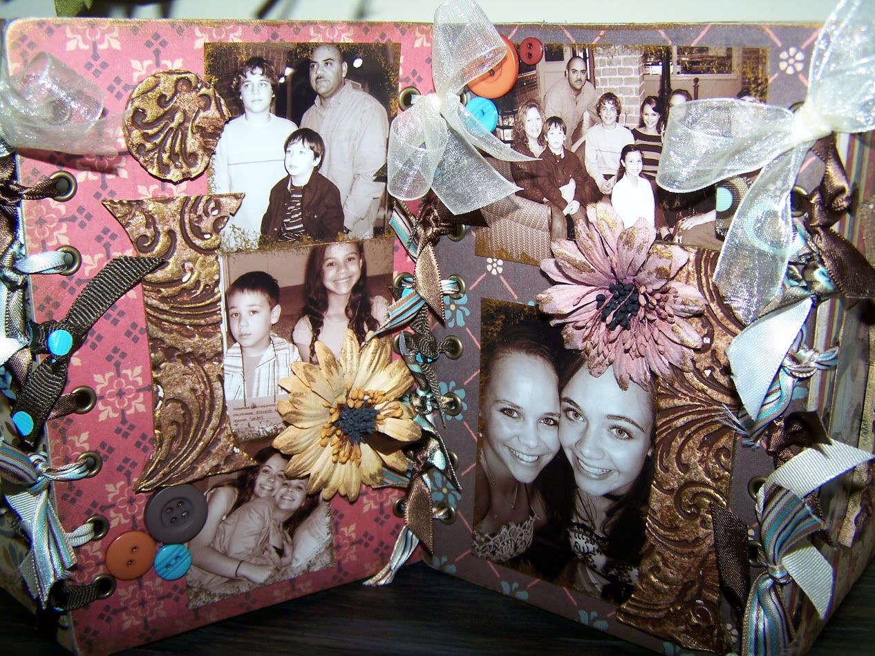
One of my very favorite alterables is Cosmo Cricket's Lacing Cards. I believe these are still readily available from a bunch of places. If not, you should go and hound them mercilessly until they release them again. They are the best thing since possibly sliced bread. Unless you're hungry, as I don't recommend eating them. They come four to a package. For my projects, I used three packages. I needed 6 cards per recipient to spell out the word FAMILY. So first, a view of the finished project. This one belongs to my mom.

Family lacing cards

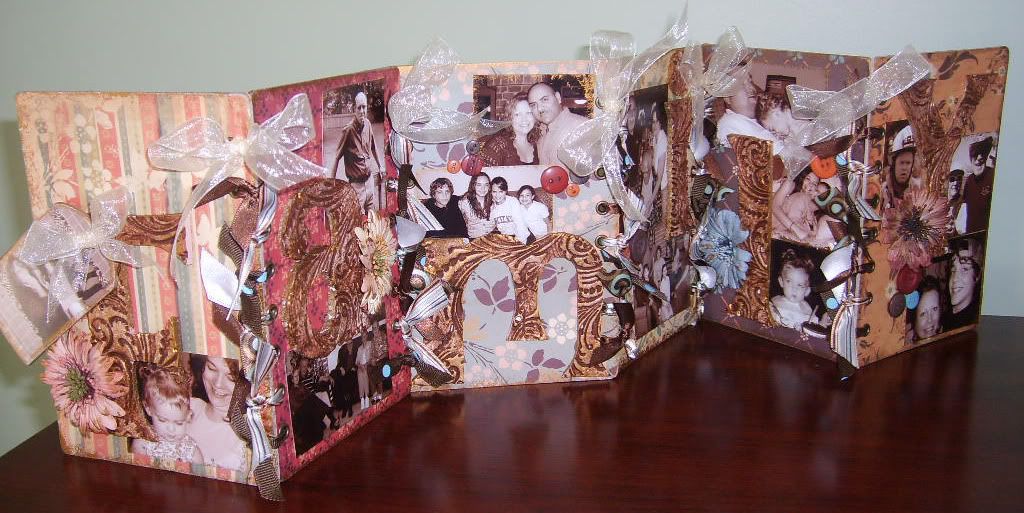
Not a bad photo overall (thanks Photoshop!). So let's talk details. The letters gracing the front of each card are not at all what they appear to be. Photobucket
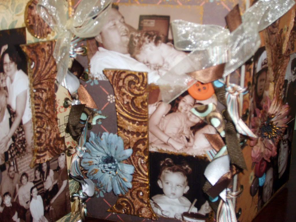
In person they have the look of tooled leather. They are something rather less than that, however. The letters started life as Crayola Model Magic. This is a very light weight modeling compound that dries to the consistence of fun foam. I rolled it out to around 1/8" thick and then stamped it, covering the surface. This can be done with would mounted stamps, but I've found the best and easiest way to do it is using acrylics. Don't worry about a block, just press the stamp into the foam, pushing firmly across the surface. The variety of pressures you apply using your fingers helps give the finished piece just that much more texture.

PhotobucketLet the Model Magic dry for a good 24 hours. Flipping occasionally to help it dry. It may crack, that's okay. Again, more texture for your finished piece. I roll it out on tinfoil using a brayer with an acrylic insert. After stamping, I transfer the piece to a double layer of paper towels. One large package of Model Magic is generally enough to do all six letters. I ended up using three small packages and had enough for both sets of cards.

Photobucket
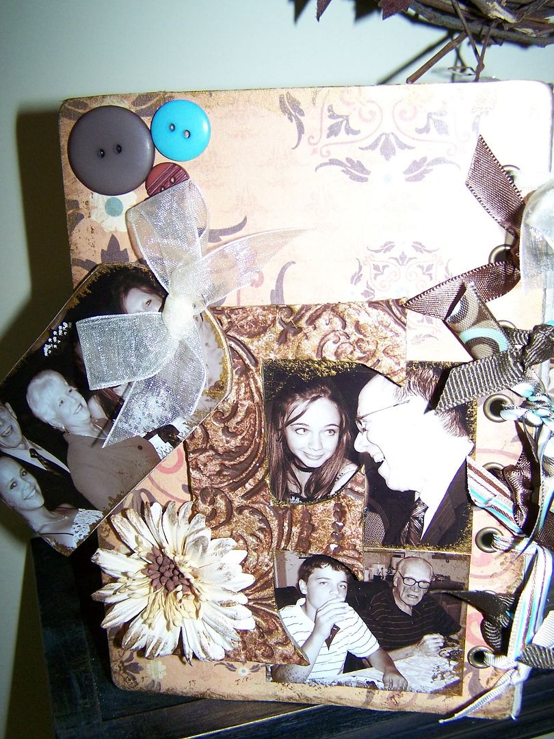
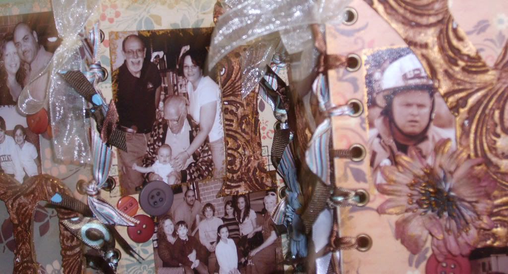
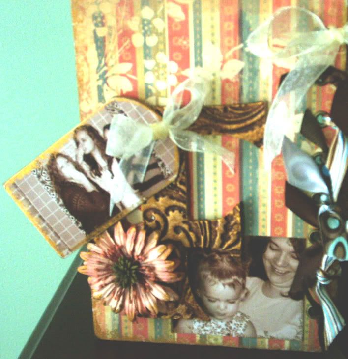
While the compound is drying, alter the cards. I used Cosmo Cricket Gretel papers. The tones worked perfectly with the sepia tint I used when ordering my prints. Plus, I knew it would match the decors in my sister & mom's house. I use Aleene's Tacky glue in the gold bottle. After drying, I used my crop a dile and repunched the holes down the sides of the cards. the outer two cards just get holes done on one side. I used the large side and followed up with We R Memory Keepers big eyelets in their antique gold finish. I edged the cards and all the photos in gold paint.

PhotobucketBack to the compound. I wanted a good chunky letter, so I pulled out my cricut and cut 5" letters using the Alphalicious cartridge set to chunky shadow. All the letters save the F are lowercase and cut from scrap cardstock. Here's a good use for that paper you can't remember what the heck you were thinking when you bought. I lay out the letters on the compound until I have them so that I can get all of them cut out of the piece. I use a craft knife with a fresh blade on a glass mat and cut around each letter. This stuff cuts like slightly soft butter.

PhotobucketTime to paint. The tooled leather look is achieved by layers of paint. I base coat in a nice cream, then apply a dark antiquing medium. I use Folk Art's antiquing medium in the darkest I can find. I want a rich look. While the antiquing medium is still wet, I use a paper towel and start wiping and dabbing it off. Once I get a nice look on all the letters, I immediately follow with the same gold metallic paint I used on the edges of the cards & photos. I use one a chunk of kitchen sponge. The ones with the big open pores that come like 6 to a package for little of nothing. I cut them into quarters and use them for all my painting on this project. I do a lot dry-ish sponging (dabbing mostly) with the gold onto the letters, then follow along behind dabbing with a paper towel. Just keep at it until you're happy. You might want to try on a scrap piece of the dry Model Magic first if just winging it is intimidating.

Photobucket
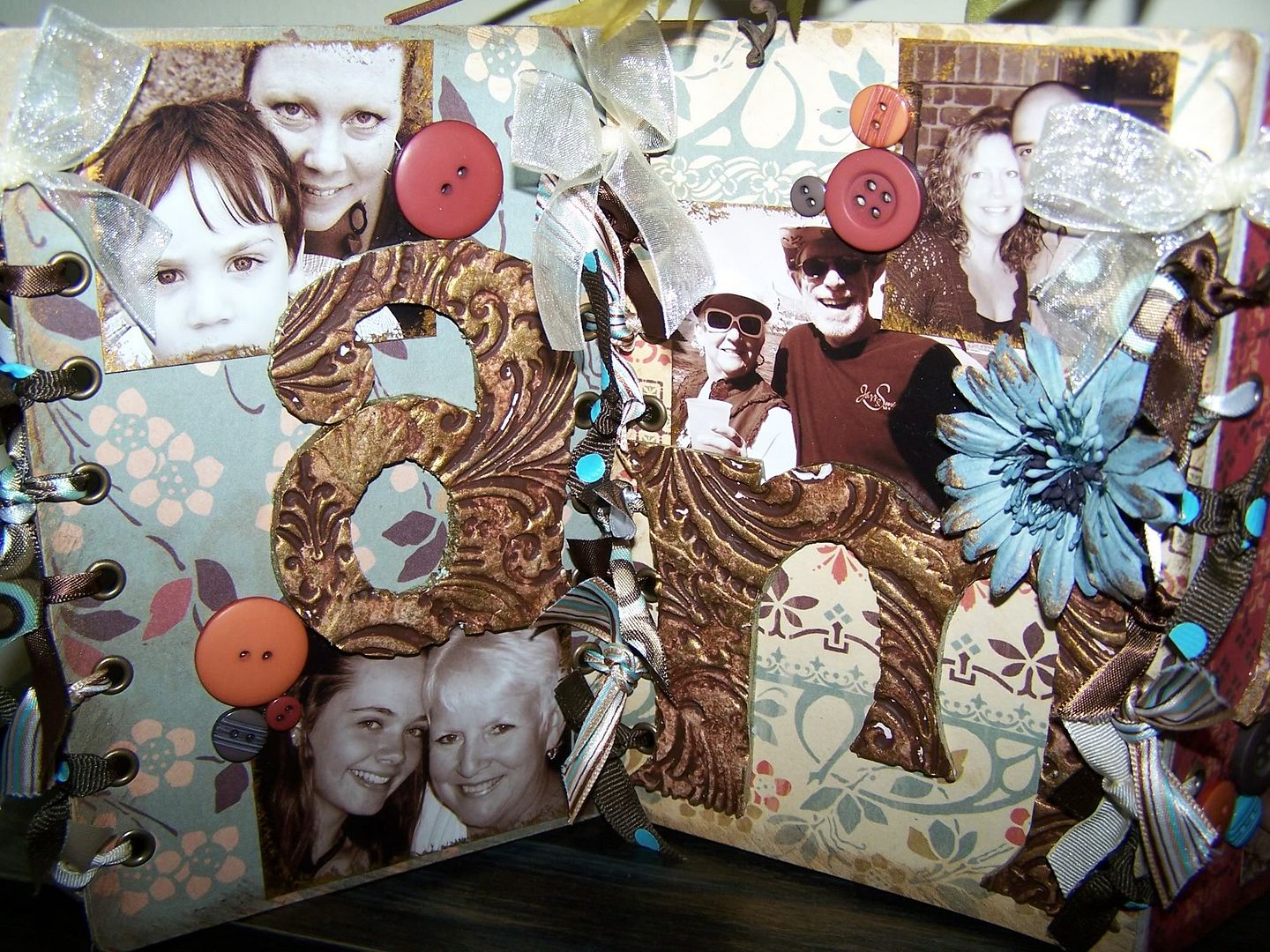
At this point, it's all assembly. I layer, move, tweak, move some more until I have my photos and letters where I think they look best, then I glue it all down. From there I go back with embellishments. Flowers, rubons, buttons. After everything is embellish, THEN I go about lacing everything up. I just tie my way up the cards with a basic knot and then do up a bow in the top hole. A bit of tweaking to get it all standing just so and you're done. Most of the close ups I've shown are courtesy of my sister, who does better close work, but forgot to take a picture of the Y card at the end.

Project Supplies The stamp I used for my letters is the two giant swirls from the Fancy Pants Designs Pollen Dust set. The flowers are from Prima. The buttons are from Basic Grey, I think. One of their first button releases. The ribbon is Ribbon FX from Hobby Lobby. The lacing cards and Gretel paper are from Cosmo Cricket. Crayola Model Magic can be found at Wal-Mart and Target as well as Hobby Lobby and Michael's. It comes in a variety of colors, but I tend to stick with white as I'm going to paint it anyway.

As a side note, the trick to doing great photo gifts for your family and surprising them is to tell your sister that you're doing something awesome for your mom and can she send over her favorite photos of her family and then tell your mom that you're doing a great project for your sis and can she send some photos. Works like a charm!

Jun 26, 2009

A little challenging

50's Sweethearts - Love AlwaysLately, all I seem to be coloring up is Dustin images, so when The Greeting Farm started up their Farm Fresh Fridays a couple of weeks ago, I snagged my Greeting Farm images out of my image box and took a break from dragons and monkeys. The first is one of the few digital images available from The Greeting Farm. The 50's couple. The challenge was to use only black, white and grey. I wanted to create an old 50's photograph and felt they'd be perfect. I used a whopping 4 pencils for this image. It was definitely a change of pace! I blinged it up a Prima Say it with Crystals swirl and a bit of American Crafts ribbon. I think it will make an excellent anniversary card!

With two littles running loose in the house, I don't always have time to stamp. In fact, I rarely ever sit down and make a card from ink to embellishment. I just don't have that sort of solid block of time at my disposal. I frequently just color in between work, diaper changes, dishes, sippy cup refills, laundry, tuning the DVR to Space Chimps, cooking, more diaper changes, cleaning, and any of the myriad other chores that come from being a full time working mom. I craft and create in snippets. One day I may stamp out a couple of sheets of images, another time it's printing some digital images, maybe the next time I'll have a few minutes to make up a card. In between all of this, however, I always have a spare few moments to color or play with my Cricut software making scrappy page titles. Those two activities relax me.

That being said, I keep a small box in my "crafty bin" of supplies that sits tucked safely in the No Kid Zone in our living room. It's not for their safety, it's for my sanity. :) I can happily curl up on a corner of the sofa and color out an image while keeping an eye on the kidlets. In return, they can run up to the fence line and tell me of their latest adventure with our imaginary puppy or ask for a new show or a snack. It keeps all of us happy.

It's magicMy daughter is a huge fan of dragons and fairies. So she frequently hangs over the fence when I'm coloring one or the other. Fairy Chloe from The Greeting Farm is one of her favorite images. I get regular requests from her to stamp a few out so she can color too. Hers tend to end up as rainbow blobs that serve to decorate my refrigerator. Mine end up like Miss Chloe here, on a card. This was for the recent Three Images on a Card challenge. Tiny Tink and Chloe have shimmery wings, although you can't tell from the picture. I used water color glitter from Stamping Bella on their wings and my daughter's nose. She approved.

Roses on Paper is getting ready to release some Elisabeth Bell stamps. E. Bell is one of my favorite artists. Her little girls have such a wonderful charm to them, so when I saw they were doing a call for a few guest designers to work with Ms. Bells images, well I just couldn't pass up the opportunity! Check out their Guest DT call on their very own challenge blog. There's still a few days left to enter!

Project SuppliesThe images are all from The Greeting Farm. Paper is a variety here. The black and white is Teresa Collins, while the pinks and yellows are BasicGrey Urban Prairie. Nesties are Labels 1 and Scalloped Rectangle. Flowers and bling are from Prima, Grey/White ribbon is from American Crafts, Aqua ribbon is Ribbon FX from Hobby Lobby and as always, buttons are Creative Cafe.

Jun 25, 2009

You're old

My mom had a birthday yesterday and one of my best gal pals has a birthday today. Happy Birthday, Mom & Jenn! I made totally rocking cards for both of them, that are still sitting on my table. Even though they didn't get cards, they did get quick personal messages from me. I'm not totally lame! In honor of them aging, I have two cute cards to show you today. While I can't actually confirm that my mom wasn't around when dinosaurs roamed the earth (Love you, mom!), I'm going to give her the benefit of the doubt. Still, I find that dinosaur cards, particularly Dustin's Dinos, are excellent for birthdays. I believe I have pointed out that I have a twisted sense of humor already. :)

Meet Miss Triassic PeriodRight off I'm going to say that this isn't the best picture of the Bronto. The image is totally cute and goes well for boy or girl. I was trying some new cardstock, which has more "tooth" or texture than my beloved Pure Lux. This means when I color it puts more pigment down and sucks up more Zest it. Since the Zest-it is a solvent, it wants to eat into the laser toner I use to print my images when I get too much on there. I had to stop and set the image aside a couple of times to let it dry when I noticed some smudging on my lines. You can't tell on the final piece, even if the photo had been better. It's just something you have to be aware of when you're working.

Second Runner Up - Miss Imminent Ice Age!I do find, as on Miss Steggo here, that the rougher stock makes the final piece a bit more vibrant. This is because there is more pigment on it, but I do like the effect. She's a scrapper, as is the card. She's one of the last cards I put together this week, so she ended up with the scraps from the rest. I used them in a window pane effect behind her and the pink circle was a left over bit from the sheet I used on Miss Bronto.

So what paper did I use for my coloring? This is the new Rustic Vanilla from PaperTrey Ink. Do I like it? Overall, yes. Will it be my regular go to paper? No. I enjoy using it and will do so frequently, but I prefer the smoother surface of the Pure Luxury cardstock. So how does it rate overall in my paper sampling? I'd give it a definite 8. This is in comparison to a 9.5 for the Pure Luxury base weight cardstock. I got both the Rustic Vanilla I used here and the Rustic White, which I'll show more in another post. The vanilla is a very light cream tone and the two look near identical in the package. I actually thought I'd gotten two of the same thing when I pulled them out of the box. Out of their wrapper, however, there is a discernible difference.

While it does have more tooth than the Gina K Pure Luxury cardstock, it is still a nice smooth stock. If you haven't read about it on Nichole's blog, the "rustic" aspect of the cardstock is that it has flecks and bits that make it look more handmade than standard pure cardstock. My printer took to it well and the toner fused to the surface. I mention this because I have had problems with Bazzill cardstock where the toner did not fuse because there was just too much texture. I can't tell you how it rates against the regular PaperTrey cardstock as I haven't tried that. I feel a bit silly ordering up plain white & vanilla cardstock when I have a good selection of Pure Lux ready to use.

I mentioned earlier that I have to use more Zest-it when I'm using the rougher cardstock. The cardstock is more porous and absorbs it quickly while I'm working. It does fine if I'm working in small spaces, but large spaces like my dinos here, were challenging. I used probably twice to three times as much on these images as I would have on the smoother Pure Luxury cardstock.

Okay, I know some of you use the Georgia Pacific cardstock. I do have a supply of this that I normally use for card bases, but I have used it for coloring. In comparison, I rate it at a 7 to 7.5. The PTI Rustic cardstock has slightly more tooth than the GP, but makes up for that in thickness and visual appeal. I found the PTI stock to be thicker and more resiliant to my pencil work. The Georgia Pacific worked, but I tend to have more issues with image smear. The combination of solvent, GP and toner just doesn't "stick" as well as on the other papers. Additionally, the other issue I have with GP is exclusively with my digital images. I do not get a true black when I print on Georgia Pacific cardstock. It prints a very dark grey. This should not be an issue if you're using an inkjet, but it's something to be aware of if you're using a Laser Printer or copier for your digital images.

Project Supplies I promised in the last post that I was going to set the DCWV papers a side for a while and I have held to my promise here. I broke out my new Basic Grey Urban Prairie pad and used a good 75% of the pad across a stack of cards. You'll see more of it in upcoming posts. I used circle, rectangle and rectangle scallop nesties. Flowers are Prima, colored cardstock is American Crafts, ribbon is Ribbon FX from Hobby Lobby and buttons are once again Creative Cafe. The Rustic Vanilla cardstock and twine in the buttons are from PaperTrey Ink.

Get your dinos at Dustin's Place and don't forget to snag yesterday's freebie! It's a great background for the dinosaurs.

Jun 18, 2009

Are we there yet?

Sunday is Father's Day and in honor of that great day, I have two cards. One of these is going to my dad, the other to my husband. To all dads out there, Happy Day!

Are we there yet?Growing up, I got to travel quite a bit courtesy of the US Army. I have lots of great memories from the various places we lived. In between the big trips that often crossed oceans, my Dad made sure that we got to see as much of each place we lived as was possible during his tour of duty. My Dad is a big fan of road trips. We would load up into our car and off we'd go. Sometimes it was just day trips to local sites, other times it was grand adventures that cross state and country borders. In all my memories, I never remember saying "Are we there yet?", although I'm sure at least one of us kids uttered it. I do, however, remember "I gotta pee!" and "I'm going to be sick!". As the shortest child of three, I inevitably got to sit in the center of the back seat. My siblings learned to dread the second phrase.

So, for my father, and the wonderful memories I have of a small cream colored station wagon, cruising across Europe, Happy Father's Day! Thanks for the amazing memories.

Mr. Fixin' ItFor my husband, I have a different card entirely. I have been with this great guy for nearly 23 years and in that time I have bought exactly ONE curling iron and TWO hair dryers. Do the math. The second hair dryer was only a couple of months ago. I swear my husband can fix darned near anything. Before he was a fire fighter, he was a mechanic, so my vehicle runs in tip top shape. The great man even makes sure it is full of fuel each week before I head off to work on Monday morning. In addition to cars and small appliances, he remodeled our house. He even cooks, although the guys at the fire station eat his cooking far more often than I do.

For our cute children, he fixes run down batteries, kisses boo-boos, discretely disposes of shredded books or broken toy boxes, changes diapers and is a particularly awesome Mr. Mom on his days off. I love this man! Yes, they do still exist! For those of you wanting to know, I didn't find him. He found me...but that's another story. Happy Dad's Day to the very best dad my kids could ever have!

Project SuppliesWhile I'm not going to make any promises, this should be the last of the Citrus pad for a while. I used the circle nesties for the turtle and a Provo Craft Embossing Folder on the dragon.. Flowers are Prima, Cardstock is a mix of American Crafts and Prism. The ribbon is Ribbon FX from Hobby Lobby, eyelets from Making Memories and the buttons are once again Creative Cafe. The images are from Dustin's Place. Grab them while they're hot and check out today's new release while you're at it!

Jun 15, 2009

Twisted Humor

I have a rather twisted sense of humor. Some of it comes from working with geeks and some of it from being married to a fire fighter. Most of it, however, I attribute to genetics. My entire family is "blessed" with a similar mind set. For example, my parents once picked up my Aunt & Uncle at the airport dressed as a hooker and her pimp. My Aunt & Uncle in return picked them up a few months later at a different airport dressed essentially as the Clampets, complete with pick up truck equipped with a rocking chair in the back. This is my family and I love them dearly. I know them well enough that we drive when we visit. It's just safer.

Lend a HandAny one of my friends or my family would love today's cards. They have just that sort of sense of humor to them. The first is from a recent freebie over at Dustin's Place. I started giggling as soon as I saw it. It made me think of the saying "Friends help friends move. Really good friends help friends move bodies". Currently, the card doesn't have a sentiment with it, although I've debated adding "Need a hand?" to the front and following it up with "I remember where we buried some".

Early BirdAnother favorite saying of mine is not "The Early Bird Gets the Worm". Most of my family is extremely punctual. Growing up in my house, if you weren't on time, you were left behind. I tend to be almost psychotically early to this day. My sister, on the other hand, is generally late to everything. Between us, if you base things on averages, we're on time. So while I'm habitually early, I've often thought the early bird saying was annoying until I heard a much better version of it. A version far better suited to my sense of humor - "The early bird may get the worm, but the second mouse gets the cheese". Personally, I think the second mouse made out better, but then, I'm not a big fan of worms. :)

Project SuppliesI know, I know! You're thinking, what? More Citrus Pad? :) You can definitely get one heck of a lot of cards out of a small 8x8 pad! I used the circle nesties for the bird card. Flowers are Prima, Cardstock is a mix of American Crafts and Prism. The ribbon is Ribbon FX from Hobby Lobby and buttons are once again Creative Cafe.

Jun 10, 2009

Beware of flying poo

Shortly after getting on Dustin's design team, the man himself asked us for image ideas. What would we like to see? I asked for two images in particular and was rewarded, nearly immediately, with one of those images. The Code Monkey. He's a rockin' little critter. Happily hacking away at his laptop (banana inside). I fell in love with him as soon as I saw him, but I wasn't sure just how I was going to use him.

In real life, outside the blogging word, I work as a project coordinator for a team of internet people. It's like herding cats...or in this case, code monkeys. I have met and worked with some really great people. Many of those have since moved on to other things, in other towns far and wide. A few of those I have managed to keep in touch with. We talk regularly through instant messaging and internet chat rooms. We make an effort to stay in touch. Recent events at one of their work places meant that his office was going green. Going green apparently meant doing away with their hot chocolate.

Over the years of working intimately with Code Monkeys, I have learned that there are certain basic essentials to keeping them going. Those being coffee, sodas with excessive caffination and hot chocolate. You should never take hot cocoa away from an internet programmer. It just isn't safe. All of these events came together just a couple of weeks shy of his birthday. A plan was hatched and grew into, well, this:

Code Monkey full set - beware of flying poo


I printed off five monkeys, four in the standard size and one I scaled up to created a larger version. I had the lunch tin tucked away in my stash, gathering dust. It had been on sale at the time that I needed one, so I bought two. This was my spare. Using a templates I found on one of my blog hops, I adjusted the measurements to make it deeper and embellished it with a monkey, creating a holder for hot chocolate. It neatly held 6 packages of Swiss Miss cocoa with marshmallows. I made simple sleeves for the remaining 4 packages of cocoa.

Code Monkey Emergency Survival KitUsing an empty Stash Tea box as my guide, I created a second box and filled it full of a variety of tea. The Code Monkey in question quite likes tea, and has to make due with Lipton (shudder) at his office. I finished the box off by boxing off a package of Wrigley's Extra gum in Strawberry Banana. The card was a collaboration with another programmer. I requested poorly written code that if it had been used would return one of two things. The first was a Happy Birthday sentiment, the second was "Banana, banana, banana. Reboot Universe". The inside of the card reads -

if (!world.EOF && jeff.Sane)
{
Console.WriteLine("Happy Birthday!");
}
else
{
Console.WriteLine("Banana, banana, banana. Reboot Universe");
world.Break();
}


Danger, Monkey Coding. Beware of Flying PooThe card is quite large, at 5 1/2 x 7. I figured the monkey might need a warning sign for his office cube and the card front will double as that nicely. All of this was packaged in a suspicious pink bag and delivered via two different couriers. The first, I paid in large quantities of coffee. The second got paid by getting to watch the recipient open the bag. I had arranged for a photographer to capture the moment, but sadly the events transpired without a camera. All in all, it was good. The recipient responded -

This will prolly break your heart a little.
LadyPatsFan wasn't available to take 'pics.
The pink sack was a nice touch.
I'm currently taking many pics for the blog.
This is awesome stuff.
And the monkey is PERFECT.


Simple rewards is what it's all about. Happy Birthday Code Monkey!

Project Supplies A change of pace here. The papers are all from Imaginisce, in their Wild Things line. The bamboo and tropical leaves are the perfect accompaniment to the little monkey image, or any of Dustin's other monkeys. The cardstock is a mix of American Crafts and Bazzill. The monkey images were cut with Nesties Labels 2 & 3 and the Circles. The images were colored out with Primascolor pencils and blended with Zest-It. The monkeys in the photo background are part of one of my son's blankets. :) Get the code monkey for FREE from Dustin's Blog.