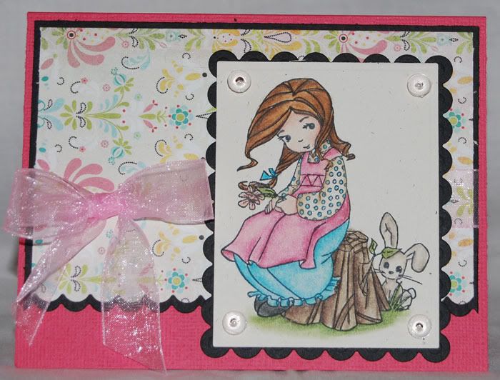
While I haven't blogged, it doesn't mean I haven't done other things. In fact, I've done lots. I find coloring and cardmaking to be quite relaxing. Let's start with a card I did up for Becky over at Page Maps. She buzzed me back in July asking if I'd do up a sketch for her September card maps. Of course I said "absolutely!"
 It was a fun sketch, but a bit challenging for me. I took several stabs at it, trying to stay true to what Becky had drawn. It just wasn't working for me. First off, I just don't put sentiments on the front of my cards. It's not laziness, I simply don't like confining my cards to a simple statement. That way I end up with a fine stash of blank note cards ready for whatever I need at any given moment. I can always add one to the front later if I choose, although to be honest, they nearly always go on the inside. Once I let go of the sentiment, the card just fell together!
 Even though I'm a huge tool junkie, I've just never been a big fan of punches. This includes border punches. It means I have to be doubly creative when I want things like a cute mini scallop border on one side of some patterned paper. Nestabilities to the rescue! I cut my patterned paper and black mat to size, then lined up the patterned paper, centered on top of the mat while keeping it lined up on the edge I was going to cut. Then I ran them both through with one of my long rectangle scallop dies. when I separate the two layers, I have perfectly lined up scallops on the paper and the mat.
The image is called Peek A Bunny. It's an Elisabeth Bell image from Sugar Nellie, courtesy of Funky Kits. It will make for a cute "Hi" or "Thinking of you" card. I always have a need for those. You'll notice that I filled the orientation of the sketch and made the scallops for the sentiment go all the way across. The card felt more balanced to me this way. A few dew drops and some ribbon finished it off.
 The paper is BasicGrey from the Urban Prairie mini stack. I love those little 6x6 paper stacks. They're perfect for cardmaking, leaving me little to no scraps left over to feel guilty about dumping in the recycle bin. I use rectangle nestabilities here, all in rectangles. The image and mat are done with the regular sized rectangles and matching scallops while the outer piece was done with the long rectangle scallops. The cardstock is American Crafts, ribbon is Ribbon FX from Hobby Lobby and the dots are Dew Drops. The image was colored on PaperTrey Ink's Rustic White with Prismacolors and blended out with Zest It. Becky has some great card maps available this month. Be sure to stop and check them out!
1 comment:
Very nicely executed V. Beautiful coloring of course and I LOVE the layout!
Post a Comment