Mar 27, 2009

Dustin Pike Rocks!

For me, there is just nothing like the smell of fresh rubber in the house. Right now, I actually have a small pile of it on my desk, mounted and ready to stamp, but that's not what this post is about. This post is about digi stamps and the every amazing Dustin Pike. Sometimes the perfect image comes along and it just happens to be a sweet black & white printable line art rather than deeply etched rubber. So what's a girl to do? Well, heck, print it off, of course!

Dustin Pike is an amazing artist. I actually found him years ago through his Mooseberry graphics clip art. I bought a couple of pieces way back then, but haven't a clue where I stored the files. To be honest, they're probably gone forever due to a hard drive crash a few years ago. Aside from that, I'd really lost touch with his art. That was way back before blogging became a daily (hourly?) word.

I must say I was delighted when I saw a post on Splitcoast about a free dragon digital art image. I adore dragons, but good stamps and images of them are hard to find. When I found out it was a Dustin Pike dragon...I had it snagged onto my hard drive before you could say "Dustin Pike Totally Rocks!". Actually, by the time I saw the post, he had TWO dragons up for grabs. They're extremely cute and are both now living on my hard drive.

So how do you go from sweet digital image to great looking card? The majority I've seen are using Word to get the image from computer to printer. I used Photoshop Elements. It allows me to place my images for the least amount of cardstock waste. I created a new 8 1/2 x 11 blank image and then layered two each of the dragons into the file. I also added two each of a couple of Greeting Farm images I bought last month. I saved the file for later use on a hard drive that does an auto backup each night (see, I do learn from my mistakes!) and then printed. Now, I understand that some people have problems with smearing. I did not, but I'm using a sweet high end Brother color laser printer. It's the same one I used for my Prismacolor chart, so I knew the images were going to work perfectly with my coloring medium of choice. I printed onto a sheet of Gina K's Pure Luxury Base Weight White. Man, I love that stuff!

I didn't get a chance to make the images up into a card just yet, but I did have some time to color. I seriously love how they turned out.
Go Fly A KiteJust Hatched Dragons
I used the My Minds Eye Bloom & Grow papers, the Grow Just Stripes in particular, to match up my colors. I bought a selection of these at the local scrap store the other day intending to make cards out of them. I know they're going to be perfect with these dragons. My colors are:

Dragons - Goldenrod, Pumpkin Orange, Crimson Red, Burnt Ochre, Jade Green, and Muted Turquoise
Grass - Kelp Green
Chick & Egg - Goldenrod, Yellow Ochre, Warm Grey 30%

What do you think? Heck, why are you still reading this? You should be off snagging those cute little dragons from Dustin' blog. Scroll a bit, you'll find them. Take a moment to leave him a comment and let him know he totally rocks. Hopefully, he send a few (lots) more critters our way!

Mar 16, 2009

A Little Bit of Sugar

Back in February, I won a bit of sugar...Sugar Nellie that is! Last week, they finally arrived. Two darling, yet to be released Elisabeth Bell stamps. LOVE THEM!! I had both stamped and colored and ready to make up into a project. The Sugar Bowl challenge this go around is cards/projects for Mom. I know my mom is going love getting this card! I haven't decided if it will be for Mother's Day, her birthday, Easter, or just because I'm thinking about her. Just because will come the soonest, and I've got a couple of mini-books that need to head her way, so that's the most likely. She loves getting handmade cards and keeps them forever. She's one of those people you put a little extra into the card for because you know she'll treasure it, rather than trashing it.

Basketful of Happiness by Elisabeth Bell, from Sugar Nellie at Funky KitsI used this week's cupcake challenge sketch #59 that Miss Taylor does. I turned the sketch on its side to accommodate my vertical image. As most of my cards are either hand delivered or tucked into a package of other things, I rarely worry about envelopes. That gives me a lot of freedom when it comes to card sizing. I over sized this one in length by 1/2 inch, so it's 6 x 4 1/4.

The card is colored with Prismacolors & blended out with baby oil, ink is Memento Tuxedo Black. Cardstock is Prism for the card base, My Mind's Eye for the patterned and Gina K Pure Lux for the image. The ribbon is Ribbon FX from Hobby Lobby. The image is available Funky Kits now!

Mar 13, 2009

They're Here!

I am the proud owner of a lovely set of 120 Prismacolor premier pencils. I adore them. While I was waiting for them to arrive, I did some searching as I'd come across a tutorial on Splitcoast Stampers for a technique called "Gamsol Magic". In a thread discussing pencils on the same forum, I found one of the better step by step look at the blending here. It's just photos, but it convinced me to snag a bit of cotton batting off my sewing machine and add a bit of baby oil to it in a small jar.

Now if you've followed me this far and have checked out that first link, you're probably wondering where in heck the baby oil came into play. The original technique tutorial I found used Gamsol or Odorless Mineral Spirits. As my 3 year old daughter will poke her fingers into just about anything and then ask about it, I knew it was a bad idea. After reading several posts about people using Baby Oil instead, I figured it was at least worth a try. Baby oil is essentially just a scented mineral oil, so I don't worry so much about those little fingers. The thought of her getting her fingers in OMS, which is a solvent, makes my heart go pitty pat in not a good way.

That being said, I use a bit of 100% cotton batting well saturated in baby oil in the bottom of a stage 1 baby food jar. The 3 year old has a 11 month old baby brother, so I've got a stock pile of those right now. I can honestly say that I'm thrilled with the results I'm getting. The images don't even look like they've been "penciled". And, not at all to my surprise, my daughter had her fingers in the jar poking at the baby oil soaked batting in nothing flat. There are days when I swear the girl can teleport! She spent a few hours with her hands smelling of baby oil and I was reminded that she can reach considerably farther than I expect on any given day.


Photobucket
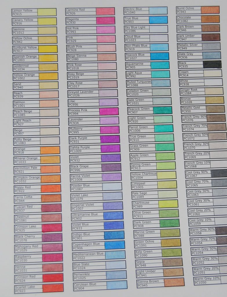
Let's talk usability. I highly recommend you take the time to sit down and make up a color swatch chart. I invested about a half a day. Keep in mind that I'm working with the restraints of a toddler and a pre-schooler. You can probably accomplish the same thing in half the time. I created the swatch chart in Excel and after a bit of tweaking, printed it off. I used four columns as my pencils are in a tin with four trays. Each column matches a tray, so I can instantly find the color I need.

My prismas did not come in this color order. They came in some order that I'm sure makes perfect sense to Sanford's packing and shipping department. However, they very thoughtfully included an information booklet that had the colors listed in this order. Since this order groups color families and like colors making it easy to pick shading colors, I spent the better part of an hour rearranging.

I sacrificed a sheet of my Gina K Pure Luxury Base Weight cardstock in order to create my chart. I highly recommend you use a sheet of the cardstock for your chart that you will be using for the majority of your coloring. Your chart should reflect the color, tone and blending that you will get when working on a larger project. You'll be tempted to grab a sheet of cheap sacrificial cardstock to make the chart, but seriously, use the good stuff. You'll be happy you did in the long run.

Photobucket
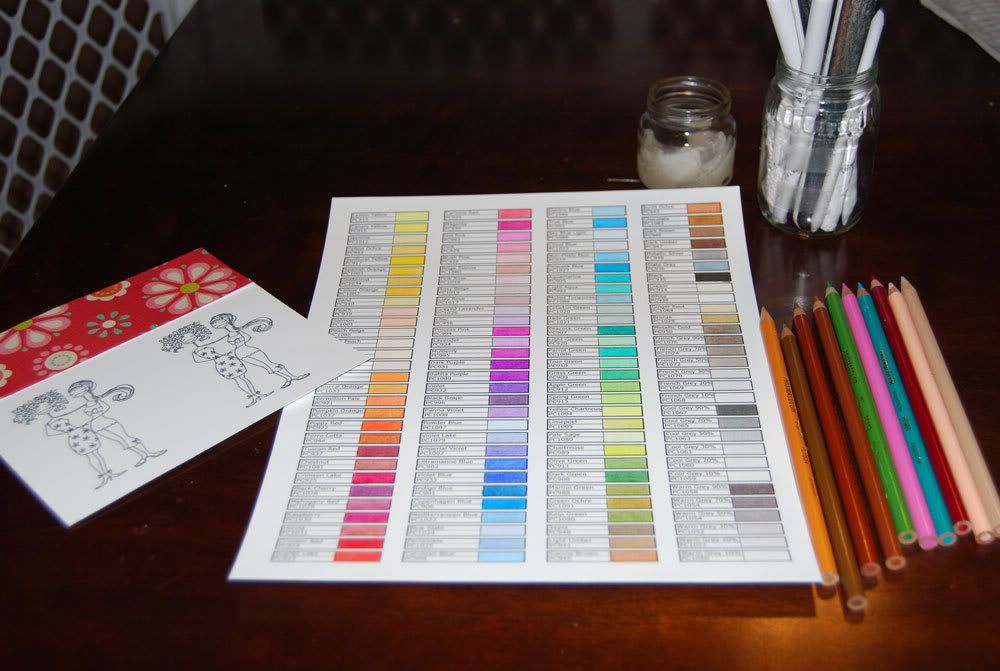
Here's my setup. I've used my color chart and a piece of paper I'm planning for the card to make color choices for my images.

Application is as simple as pushing the paper "stump" into the cotton batting until it absorbs some of the oil. The batting should be saturated, but you don't need a puddle hanging out around it. Take your time and play with how long you need to poke the batting with the stump to get enough oil to move the color. You can get too much baby oil on the stump and things will get a bit oily. To be honest, I really only have a problem with this when I'm using a lower grade of cardstock for my images. I moved to Gina K's base weight Pure Luxury (my new bestest cardstock ever) and my results increased dramatically with less oil overall.

If you do get too much oil on the stump, give it a rest for a few seconds so the stump has time to absorb the excess. If you're impatient, or the baby is wailing his cute little head off because you decided to blend one small area before you give him a bottle (don't ask me how I know about that, okay? ), give it a quick scrub on your sand paper and try again.

Most tutorials I've found have you laying down a heavy line around the outer edge of the image. I'm not a huge fan of the very light to white centers that this technique gives me. For me, I've found that a light coloring gives me a smooth base to layer and shade on. Additionally, I've found that most of the info sites have you doing just one area at a time. I prefer to do a quick pencil of the entire image and then return to blend and shade. Keep in mind the constraints I'm working under. It's frequently easier for me to do a bit of pencil work on several images while I'm keeping watching on kiddos playing in the yard. Technique and style is often a product of environment. That being the case in my situation, I can easily show you before and after shots of coloring and blending. The left is penciled, the right is blended and shaded. Click for larger on both. The images are Huggybellas from Stamping Bella

PhotobucketPhotobucket


Final Notes - I'm given to understand that the OMS will produce better results than the baby oil, so if you're comfortable having that around, definitely give it a try. I've been doing some research online trying to find a more eco (and kid) friendly option. I found a product called Zest It! in the UK. It's made, not at all surprisingly, of the oils from orange peel. I haven't ordered any yet as I've been trying to find something a bit more "local". I am very tempted though as their product details include specific information on using it to blend pencils. They've even bottled it in smaller containers as a "pencil blend". VERY tempting.

Mar 10, 2009

I Do Special Requests

A couple of months ago when I did my first in a long time stamping spree, I bought an Elisabeth Bell stamp from Sugar Nellie (via Funky Kits) that made me think of my daughter. She immediately declared the stamp "her girl". Although I done quite a bit of playing with the image (see my water coloring experiments in the Great Copic Debate post), I hadn't made her up into a card. The first week of March heralds in 4 birthdays in our house falling in a short 5 day span between the 5th and the 10th. My adorable now 3 year old daughter is one of those days.

During a mad house cleaning event prior to the family descending upon the house for a joint birthday celebration, I was picking up my stamped images. I had a few of my early run tests that had come out less than perfect. In an attempt to distract my daughter and get a few more things done, I handed over two of the images and her crayons. She happily made cards for her Gramma and Aunt. When she was done, she insisted I make a card for her birthday with her girl and a dragon. She's an eclectic little girl. :)

The more I worked on the card the more elements were required. She should be pink and there should be flowers. The girl and the dragon were the most important though. Never one to disappoint in the face of her daddy's eyes and curly golden hair, I made up this little gem -
Linsey's Girl Card

And the requested dragon on the inside -
dragon bit