Dona called to tell me she had new DT stuff for me. I was quite excited to hear it was American Crafts products. They are another of my favorite manufacturers. I normally lean towards shabby chic and vintage/grunge look papers, so their clean bold patterns are a change of pace from some of the others I love so well. Turns out, this time around, they gave all three of the DT the same line of papers. Not the exact same papers, because if you know American Crafts, then you know that one of their lines can easily encompass 20+ different designs. They all coordinate, though, so I'm really looking forward to seeing what the other two girls put together.
The paper is all from the American Crafts Romance line; lots of reds, pinks, creams and browns. Our one stipulation was that we could not do anything Valentine's themed. Easy, peasy for me! I don't think I have a single valentine's day photo! Working nearby the shop made it easy for me to stop by and grab my packet. The owner let me choose between the three, only she wouldn't let me poke through them first! I had to chose based on the paper on top! ACK! I chose one with lots of circles and polka dots. Once I opened the package I was thrilled with my choice. Nearly the whole package was polka dots, with a sheet of stripes and a sheet of blocks thrown in for variety. They also gave us 2 12" lengths of ribbon and some AC Romance chipboard to use. To that, I added cardstock in bold dark pink, chocolate brown and cream. I browsed through the store trying to get some inspiration from the various products hanging out there and came across one of the new Bo Bunny word books. The word was "HAPPY". As soon as I saw it, I knew exactly which pictures I was doing.
I made the book first and used the scrap for the layout. I tend to do the essentials on my mini books and then plan a layout after I have that worked out. I knew I'd have enough paper for both, so it was just a matter of figure out which prints I wanted where. I ended up not using the stripes for the book surface since I knew I wanted it for the layout and then used the brown dots paper on the shorter pages so I'd have enough of it left as well. It's all a matter of thinking out your projects before you slice into your paper! :)
Miss is a total hat fanatic. She just loves them in all sorts and shapes. It's been this way since birth. I just love these pictures. I've been meaning to do a layout with them forever and even tried an 8x8 once with them. It didn't work with the papers I had, so I tucked the photos away for another day. That day finally arrived. I knew the colors of the AC Romance papers were going to be perfect, so I printed an 8x10 of my favorite and several others. Isn't that just an adorable smile?
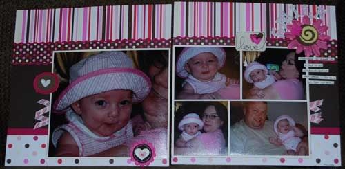
Fun fact - the flower is a Bazzill blossom paper flower. It started life white and I tinted it to match the paper I was using. I love white paper flowers for this reason. They're easy to color into something that coordinates perfectly. You can use reinkers for dye inkpads, actual clothing dye (be super careful!), watercolors and Glimmer Mists. I prefer the last two options. Watercolors is one of the easiest as I have a nice collection of then. Just put a bit of the paint in a mister bottle with water and shake. Test on scrap paper first before spraying the flower. Spritz and dry!
The HAPPY is probably my favorite project I've done lately. Miss is a huge Backyardigans nut and one of their recent releases was "Front Page News", which turned out to be a super hero themed show. Miss loved it and has been playing super hero off and on ever since. I had a big collection of shots of her zooming about the house in her cap, saving us from toe lint to giant robots and just about everything in between. We laughed that night that she was "Super Happy Girl", so the HAPPY word book was just perfect for these pictures.
With the last book, I talked about unifying pictures across a 4 month period by using a sepia tone. The shots for this book were primarily from one night, with one shot from the next day. Since her outfit was pretty consistent, I didn't have the broad timeline need that prompted me to tint last weeks photos. However, since her "costume" consisted of a dark red American Flag shirt, dark shorts and a bright aqua puppy dog blanket/cape, they didn't exactly go with the paper I was using. In this case, tinting helped unify the overall look of the book. I went with a pink tint that would coordinate with the papers I was using. It gave my happy girl and nice rosy glow.
The pictures don't show the final assembly. I intended to use book rings from the Creative Cafe. They've got them in a great selection of colors that perfectly matched this paper. But my holes were not perfectly lined up (my bad!), so the eyelets I used put the bottom ring into a bind. I opted to use a bright pink organza ribbon with white polka dots I found on the shop's ribbon rack. It looks so cute! If they don't have an updated shot for the design team blog, I'll try to take another myself on Tuesday when I'm in for kit club. Oh, and page 2 shot totally sucks! I didn't realize I had awful photo glare until AFTER I pulled the pictures off the camera. I'll see about updating that shot for you as well.
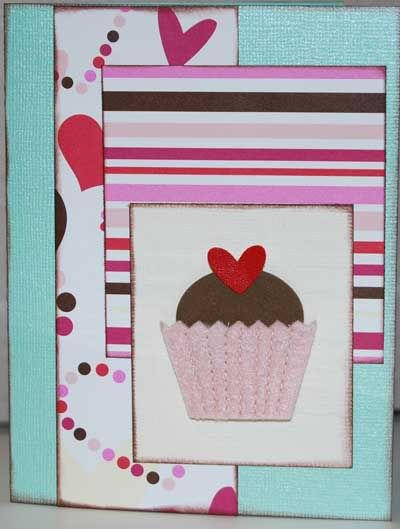
I used up every little snippit of the AC Romance papers. I had just enough left over to make a quick, simple birthday card -
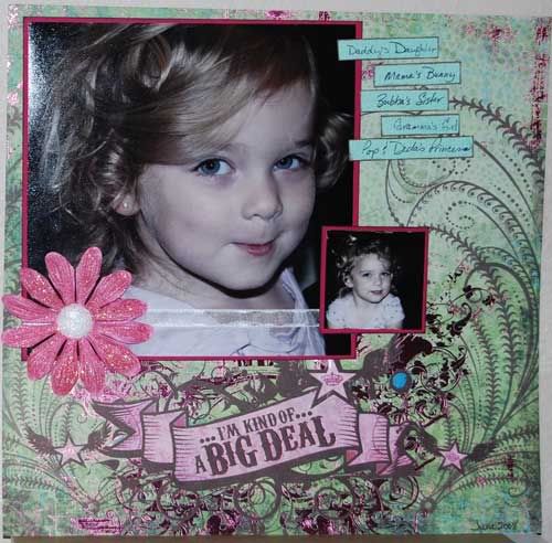
As I was browsing, I got a tour of all the new products from the shop owner. I totally love doing this as I get the inside track as to why she picked the papers she did. She showed me some fabulous new cowboy/cowgirl papers from Creative Imaginations that I just adore. I stumbled across the perfect pictures to go with them the other day. While we were looking at those, she showed me some gorgeous new Marah Johnson papers. I have a love/hate relationship with MJ designs. Either I totally love them or I totally hate them. I don't seem to have a middle ground with her stuff. This one, though, I totally loved. The paper is green with brown swirls and metallic pink "grunge" effects and the caption "I'm Kind of a Big Deal". That is so Missy! Shanel scooped the paper up and handed it to me and told me to consider it part of my DT assignment. Yay me! Check it out! I must say I adore this layout. Funny thing, the main picture here is almost exactly 2 years after the layout pic above. Can you believe she is just 2??? She looks so much older in that picture, although, that smile is still the same.
The flower on this page was altered in the same way as the one above, only this time after it dried, I painted it with a clear liquid glue and dumped pink glitter on it. The jumbo brad is a Heidi Swap, again painted with glue and glittered, this time in clear. Glitter is Doodlebug. Their Sugar Coating Glitter is fabulous!
One thing I will admit to really disliking about the MJ paper. It's not true 12x12!!! What the heck?? I didn't even notice until I was tucking everything in my bag to take back to the shop. When I laid it on top of the other layout, I noticed it was 1/2" short. Sharon and I got to looking at it at the shop and sure enough, the paper is only 12x12 with that stupid "cut me off" strip. Cut that sucker off and the paper goes to 12x11 1/2. So super annoying. I managed to gently disassemble the layout and layer it on the bold pink I had used for matting the photo. I still love the layout, but I'll be paying closer attention to MJ papers in the future. We checked the others in the shop and it appeared to be just the papers with the metallic accents. So stupid. I'll update when I get a chance to do a new photo.
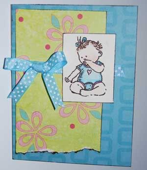
Oh, here's a card I did a week or so ago for one of the guys on the DH's shift that just found out he's going to be a daddy. Okay, I did it for him and his wife, but you get the point. :)
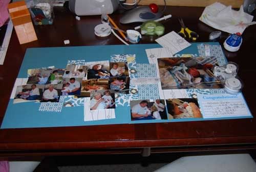
Next week is kit layouts. I've horribly neglected my kit this time around. I love the papers, but for some reason I'm really struggling with inspiration. Here's a shot of the only layout I've got going on it. I'm still trying to decide how I want to deal with the bazillion wallets I printed for this.