Nov 18, 2008

Sketch Extravaganza - Prima Style

The LSS hosted a big sketch based crop. The participants got a new sketch every 2 hours. Shanel passed out a couple of sketches to each of us on the Design Team to work up before the event. I could use whatever I wanted and my instructions were to alter the sketches, but to make the sketch recognizable from the layout. One was a single page sketch, which I rarely do, with a single photo, which I'm fairly certain I've never done. Just one photo on a layout? Isn't that a crime of some sort? :) One photo quickly became three for me. I used some of the new yummy Prima YOUth papers. This is done with a combo of the 12x12 sheets, 6x6 pad and the matching flowers. The large flower is a Bazzill blossom, the rest are Prima. Brads are Bazzill as well. Title is American Crafts Thickers and BasicGrey Chipboard letters/numbers.

Click for a large view -

Terrible 2's

The other layout was double page, multi-photo. I actually liked the original layout so I stared intently at it for a few days before I decided how to make it work. One technique I've learned from various classes is that my layouts are more cohesive when my subjects face in towards the center of the layout. That being the case, altering the sketch was as easy as mirroring it. My large photo and title are on the right hand side. My second twist was to do a Halloween layout using Christmas papers. Yep, those are Prima's gorgeous new Christmas papers, Christmas Fancy. The pinks and greens were perfect for my photos. Linsey loved being a fairy for Halloween.I did a few other tweaks to the general sketch and then I blinged the heck out of the layout. The bling flourishes are pink Say It With Crystals, again from Prima. I fussed with this layout for a while, trying to really get it to work for me. I had half a dozen or so flowers on it and just couldn't get it to flow. It was only when I pulled them off to swap them out with a different set of flowers that I realized the glitter asterisks (American Crafts Thickers) that I was using as flower centers didn't need the flowers after all! They were the perfect accent to pull the bling in line with the colors and the subject.

The title is the same American Crafts Thickers, ribbon is from Hobby Lobby, washer I believe is Making Memories. It's been in my stash for a while. It says "Believe"

Again, click for a larger view -

Magical

Nov 14, 2008

Quick Cards for Christmas

I love making cards, although I rarely do these days. When Shanel (my LSS owner) asked if I could make her some Christmas cards for her Holiday Open House coming up this weekend, I said "sure!". She needed the cards by Sunday, and knowing my timeline, I figured I had about an hour (maybe 2) to work on them and have them ready to bring in the next day. Knowing my limitations, I promised six cards. I only took pictures of 5 because the last one looked lame and unfinished. We did a bit of work on it when I got to the scrapbook store, but I didn't take my camera.

I've been dying to see the new Creative Cafe papers first hand. I keep seeing them in various spots around the web. Seeing them up close and personal, they are every bit as pretty! The kraft background behind the florals make them look so elegant and really dresses up the cards. I tried to keep my supplies limited for these so people didn't feel like they had to buy a bunch of stuff to accomplish great things.

Papers, buttons, base cards and scalloped velvet ribbon are Creative Cafe. Trust me when I say this ribbon is seriously yum-o! It's a bit expensive at 75 cents for a 1/2 yard, but well worth it. I usually buy it in yard lengths so I have it on hand when I want it. The blue is probably my favorite color, but I love it in brown and black as well. I'm nearly out and need to stock up! All of the flowers are Bazzill Blossoms. Again, love these! I have packs of them in various sizes and colors. They mix, match and layer very well. Glitter letters and remaining embellishments are all American Crafts. The glitter "spots" on the buttons are the dots that go over the J and I letters for that font. I never peel the suckers off when I'm using those letters, so I end up with them as spares. They make great flower sparkles.

And now for the cards (click for a large view)-
flower cardJoy Mitten Card
Joy Tag CardMerry card
Snowflake Card

Oct 17, 2008

Blog Neglect & New Stuff

I have shamefully neglected my blog. All I can say is that is has been a busy couple of weeks of Baby Showers, Consignment Sales, State Fairs and more Baby Showers. The DH's shift is about to explode in babies. I've got at least two more showers before the year is out.

In between all of that madness, I've been trying to squeeze in a bit of crafting. I've managed a layout, a mini-book and a cool dry erase board project. Mostly in just the last weekend. I picked up another mini book while I was dropping off my latest round of Design Team stuff at the LSS, so I should have blog fodder for weeks to come. Not to mention I haven't even blogged about last month's kit. Probably because I haven't TOUCHED last month's kit, but that's a whole 'nother story. :)

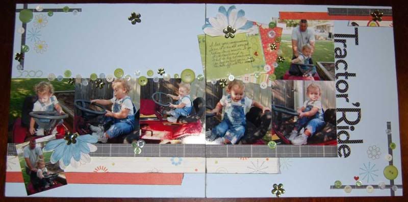
Onto the Design Team stuff. I'm going to start with the last projects first as I don't want the mini book to consume the first half of the post. So layout first. Create My Keepsake, one of my preferred scrappy forums, has started doing a Friday "Scrap Formula", in other words a sketch. They post them on Friday and in order to be eligible for their RAK drawing at the end of the month, you have to post them by Noon Sunday I believe. I know that it's such a limited time that odds are pretty high that I won't ever get it posted in time to be part of the drawing. Still, The Oct 3rd formula really sparked my imagination. It was a single page sketch, but I immediately saw how it could be a full 2 page layout. After many revisions and additions that took the better part of Monday, I finally ended up with a piece I really like. The more I see it, the more I like it. I figure by the end of the week, I'll love it. The papers, journaling cards and rubons are Fancy Pants Daily Grind, buttons from my hoard, Bazzill Blooms and bling from Prima.

I am constantly amazed by my daughter's ever growing imagination. This is an old, nearly defunct riding lawn mower. The DH used it to move the trailer around the back yard when he mows. Miss, on the other hand, considers it her 'tractor' and just loves to go sit on it and turn the wheel. I don't know where her imagination takes her, but I'm sure she's off riding into the sunset somewhere.

tractor ride

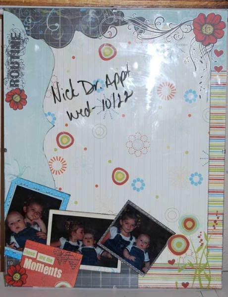
I can't really take credit for the conception of the next project. I saw a version of it on Mish's blog probably a month ago and I've just been waiting for the right products to make up a version of my own. 12x12 frames are not readily available in my area, so I went with an 11x14 clip frame. I had several ideas for how I wanted it to work out and I'm pleased to say everything came together far better than I hoped. The rubons are on the glass rather than on the paper, which means I can change out the paper and still keep those elements. I love the dimensional effect this gives, although it really doesn't come through on the picture.

I will say that you really have to want rubons on glass. It's one of those things that takes lots of elbow grease. Make sure your glass is clean. Just go ahead and clean it again to be on the safe side. It seems to help the rubons stick better when applying. Because it's glass, they're going to occasionally shift and tear. Just chalk it up to "rustic effect" because I couldn't NOT make it happen. I found for this particular design a black dry erase marker worked the best.

dry erase board

And the last project for the week, but certainly not the least. I got a comment on my blog a couple weeks back from my LSS owner asking if I would be interested in doing another word book. I really had a blast doing the Bo Bunny Happy book, so I figured what the heck. I called and she pointed me at the website for Heart of Texas Studios. She'd gotten a selection of their word books in stock and pretty much let me have my pick of book and paper. I waffled heavily between the OKLAHOMA book and the COWGIRL book. In the end, I decided on the COWGIRL one. She had some cute cowgirl papers, that I initially planned to use, but once I go there and started trying to make everything fall into place in my head, I knew they weren't going to work for me. While miss has loads of cowgirl attitude, I don't have any pictures of her in cowgirl gear, so the cowgirl focused papers didn't work.

After going through the store several times, I finally settled on another of my favored paper companies, BasicGrey. They've had some lines I haven't cared for but their last couple of releases have really rocked. The paper is from their Sultry line, which you wouldn't expect to work in a cowgirl theme. I'm pretty darn pleased with the results though. A lot of it has to do with the distressed/weathered look BasicGrey is known for on their papers. It meant that I had very little actual distressing to do myself. I pulled it more towards the western feel with silver heart buttons, a concho and some bright pink leather lacing. I use a combination of quotes and personal journaling to pull it all together. No tinted pictures this time. I kept each page to a double page layout style and put them in chronological order. The pictures span about 18 months.

Click the images to view them larger.
PhotobucketPhotobucket

Journaling -

C - There's more than just boots and a hat to a cowgirl!

O - Rough and tough; snakes and snails and puppy dog tails; in that, sugar and spice, everything nice package.

W - you don't have to own a horse or live in the west to have the cowgirl spirit. A cowgirl attitude is a way of life. Cowgirls are independent and self-sufficient. They believe in old-fashioned values and command respect. They have a uniqueness and style that is all their own.

G - "Cowgirl is an attitude, really. A pioneer spirit, a special American brand of courage. The cowgirl faces life head on, lives by her own lights, and makes no excuses. Cowgirls take stands. They speak up. They defend the things they hold dear. A cowgirl might be a rancher, or a barrel racer, or a bull rider, or an actress. But she's just as likely to be a checker at the local Winn Dixie, a full-time mother, a banker, an attorney, an astronaut." - Dale Evans Rogers, 1992

I - She'll ride to your rescue, into your heart and off into the sunset. Squealing "yeehaw!" along the way.

R - What's a cow girl without her side kick? He's not much good for anything but drooling just yet, but as soon as he starts crawling, they'll be off! The West (and the backyard) will never be the same.

L - Linsey has a cowgirl attitude. I don't know where she gets it. I guess she must have been born with it. She yearns for the great outdoors. Her imagination turns an old run down riding lawn mower into a tractor. She is wild at heart, sassy, sweet, courageous, strong and not even three yet.

Sep 16, 2008

August Kit - SEI Poppy

With all the excitement about the Design Team and my anniversary gift trip to the convention, my kit club has gotten second fiddle this month. The fact that I struggled a bit with the papers this go around also delayed things a bit. The papers were SEI Poppy. Simply gorgeous with metallic shimmery highlights. Overall, it was a smaller kit than the last one, which I expected as the metallic papers cost more. The shop owner made up for it with a great selection of embellishments. There were matching die cuts and buttons from SEI, paired with their duo toned cardstock. In addition we had cute pompom trim, Creative Cafe tags, mirrors and sand. Yep, sand. The sand challenged me and I had several ideas tucked away to make use of it, but I just couldn't make any of them gel with the rest of my layout ideas.

august kit

I added a few bits of my own after shopping at CKC. I do love these papers, so I'm sure I'll use them up somewhere. The blues and whites are definitely destined towards something altered for Christmas.

august addons

I printed four sets of pictures to use with these papers and ended up using just two. During a cleaning spurt last weekend, I sorted through a huge pile of pictures that had been stacking up on my desk. Most of them were Wal-mart muck ups, where they double printed or printed something in error and had to reprint, or their machine was broken all weekend and I decided I didn't need the pictures after all. In the midst of all of that, I did find a nice stack of photos perfect for upcoming layouts. I need a few to fill out the selection, but that's easy to remedy. One set of photos is from 3 years ago. Our last babyless vacation. I was actually preg at the time with Miss. We're not in these pictures. It's of the International Association Firefighter Fallen Firefighter Memorial in Colorado Springs. It's a very poignant place for me and brings home the fact that what my guy does isn't the safest thing. I so never want to visit this place to see my DH's name inscribed on their wall!

iaff memorial

I do like how the layout turned out, even though I basically hacked a very pretty piece of red & white paper to bits before I finally settled on a design. :) You would think with girls that flower paper would be a piece of cake. Man! I could not believe how much I fought these! Next layout is a design I pulled from the August Page Maps. I reversed the design to work with my pictures. These are of Missy's very first culinary adventures. She got to make cookies with Daddy. She was so excited. They aren't anything fancy, just one of those refrigerated rolls of cookie dough you can buy, but to her, it was culinary greatness. I've been missing my Cricut lately, so I do a fancy welded title on this one. It's probably over the top flowery, but I had fun doing it.

cookies

Last layout is one on the boy child. I did one of these with Miss a couple of years ago and I knew I wanted to do one on him. One of the side benefits of having a C-Section is that I got to have a bit of say in my delivery day. Mister timed things just right so that he could be born on my Father-in-law's birthday. My DH is the only son of an only son, who now has an only son. The name carries on. Frank passed away nearly 8 years ago. I so wish he could have been here to see the next generation of Reed's being born. He would have loved that boy!

first days

Per request, I have done larger files. Current images are 500 pixels. If you want to see them bigger, click for a 1000 pixel version. Only the layouts are this way. The kit stuff was done beforehand and I didn't go back and resize them.

Sep 12, 2008

American Crafts Romance Paper, plus some

Dona called to tell me she had new DT stuff for me. I was quite excited to hear it was American Crafts products. They are another of my favorite manufacturers. I normally lean towards shabby chic and vintage/grunge look papers, so their clean bold patterns are a change of pace from some of the others I love so well. Turns out, this time around, they gave all three of the DT the same line of papers. Not the exact same papers, because if you know American Crafts, then you know that one of their lines can easily encompass 20+ different designs. They all coordinate, though, so I'm really looking forward to seeing what the other two girls put together.

The paper is all from the American Crafts Romance line; lots of reds, pinks, creams and browns. Our one stipulation was that we could not do anything Valentine's themed. Easy, peasy for me! I don't think I have a single valentine's day photo! Working nearby the shop made it easy for me to stop by and grab my packet. The owner let me choose between the three, only she wouldn't let me poke through them first! I had to chose based on the paper on top! ACK! I chose one with lots of circles and polka dots. Once I opened the package I was thrilled with my choice. Nearly the whole package was polka dots, with a sheet of stripes and a sheet of blocks thrown in for variety. They also gave us 2 12" lengths of ribbon and some AC Romance chipboard to use. To that, I added cardstock in bold dark pink, chocolate brown and cream. I browsed through the store trying to get some inspiration from the various products hanging out there and came across one of the new Bo Bunny word books. The word was "HAPPY". As soon as I saw it, I knew exactly which pictures I was doing.

I made the book first and used the scrap for the layout. I tend to do the essentials on my mini books and then plan a layout after I have that worked out. I knew I'd have enough paper for both, so it was just a matter of figure out which prints I wanted where. I ended up not using the stripes for the book surface since I knew I wanted it for the layout and then used the brown dots paper on the shorter pages so I'd have enough of it left as well. It's all a matter of thinking out your projects before you slice into your paper! :)

Miss is a total hat fanatic. She just loves them in all sorts and shapes. It's been this way since birth. I just love these pictures. I've been meaning to do a layout with them forever and even tried an 8x8 once with them. It didn't work with the papers I had, so I tucked the photos away for another day. That day finally arrived. I knew the colors of the AC Romance papers were going to be perfect, so I printed an 8x10 of my favorite and several others. Isn't that just an adorable smile?

Smile

Fun fact - the flower is a Bazzill blossom paper flower. It started life white and I tinted it to match the paper I was using. I love white paper flowers for this reason. They're easy to color into something that coordinates perfectly. You can use reinkers for dye inkpads, actual clothing dye (be super careful!), watercolors and Glimmer Mists. I prefer the last two options. Watercolors is one of the easiest as I have a nice collection of then. Just put a bit of the paint in a mister bottle with water and shake. Test on scrap paper first before spraying the flower. Spritz and dry!

The HAPPY is probably my favorite project I've done lately. Miss is a huge Backyardigans nut and one of their recent releases was "Front Page News", which turned out to be a super hero themed show. Miss loved it and has been playing super hero off and on ever since. I had a big collection of shots of her zooming about the house in her cap, saving us from toe lint to giant robots and just about everything in between. We laughed that night that she was "Super Happy Girl", so the HAPPY word book was just perfect for these pictures.

With the last book, I talked about unifying pictures across a 4 month period by using a sepia tone. The shots for this book were primarily from one night, with one shot from the next day. Since her outfit was pretty consistent, I didn't have the broad timeline need that prompted me to tint last weeks photos. However, since her "costume" consisted of a dark red American Flag shirt, dark shorts and a bright aqua puppy dog blanket/cape, they didn't exactly go with the paper I was using. In this case, tinting helped unify the overall look of the book. I went with a pink tint that would coordinate with the papers I was using. It gave my happy girl and nice rosy glow.

The pictures don't show the final assembly. I intended to use book rings from the Creative Cafe. They've got them in a great selection of colors that perfectly matched this paper. But my holes were not perfectly lined up (my bad!), so the eyelets I used put the bottom ring into a bind. I opted to use a bright pink organza ribbon with white polka dots I found on the shop's ribbon rack. It looks so cute! If they don't have an updated shot for the design team blog, I'll try to take another myself on Tuesday when I'm in for kit club. Oh, and page 2 shot totally sucks! I didn't realize I had awful photo glare until AFTER I pulled the pictures off the camera. I'll see about updating that shot for you as well.

Photobucket

Photobucket

Photobucket

Photobucket

Photobucket

Photobucket

Photobucket


I used up every little snippit of the AC Romance papers. I had just enough left over to make a quick, simple birthday card -

Cupcake card

As I was browsing, I got a tour of all the new products from the shop owner. I totally love doing this as I get the inside track as to why she picked the papers she did. She showed me some fabulous new cowboy/cowgirl papers from Creative Imaginations that I just adore. I stumbled across the perfect pictures to go with them the other day. While we were looking at those, she showed me some gorgeous new Marah Johnson papers. I have a love/hate relationship with MJ designs. Either I totally love them or I totally hate them. I don't seem to have a middle ground with her stuff. This one, though, I totally loved. The paper is green with brown swirls and metallic pink "grunge" effects and the caption "I'm Kind of a Big Deal". That is so Missy! Shanel scooped the paper up and handed it to me and told me to consider it part of my DT assignment. Yay me! Check it out! I must say I adore this layout. Funny thing, the main picture here is almost exactly 2 years after the layout pic above. Can you believe she is just 2??? She looks so much older in that picture, although, that smile is still the same.

Kind of a big deal

The flower on this page was altered in the same way as the one above, only this time after it dried, I painted it with a clear liquid glue and dumped pink glitter on it. The jumbo brad is a Heidi Swap, again painted with glue and glittered, this time in clear. Glitter is Doodlebug. Their Sugar Coating Glitter is fabulous!

One thing I will admit to really disliking about the MJ paper. It's not true 12x12!!! What the heck?? I didn't even notice until I was tucking everything in my bag to take back to the shop. When I laid it on top of the other layout, I noticed it was 1/2" short. Sharon and I got to looking at it at the shop and sure enough, the paper is only 12x12 with that stupid "cut me off" strip. Cut that sucker off and the paper goes to 12x11 1/2. So super annoying. I managed to gently disassemble the layout and layer it on the bold pink I had used for matting the photo. I still love the layout, but I'll be paying closer attention to MJ papers in the future. We checked the others in the shop and it appeared to be just the papers with the metallic accents. So stupid. I'll update when I get a chance to do a new photo.

Oh, here's a card I did a week or so ago for one of the guys on the DH's shift that just found out he's going to be a daddy. Okay, I did it for him and his wife, but you get the point. :)

baby card

Next week is kit layouts. I've horribly neglected my kit this time around. I love the papers, but for some reason I'm really struggling with inspiration. Here's a shot of the only layout I've got going on it. I'm still trying to decide how I want to deal with the bazillion wallets I printed for this.

first days

Sep 8, 2008

Adventures with Fancy Pants Papa Papers

This is actually last week's post. It's a bit disjointed and rather rambling. It was just one of those weeks. Stick with me. The pictures at the end are worth it. Another post on this weekends scrapping activities is coming shortly.

My very first Design Team assignment was challenging. It was Fancy Pants Designs, which I usually totally love, but this was one of those lines I looked at and just didn't care for. I knew as part of my DT assignments that I was likely to get papers I would never pick up for myself, so I was prepared. The paper is very masculine and one sheet has titles and quotes about Hero and Brave. Not my choice for fire fighter layouts, but I was sure I had at least one picture to use on it. One layout out of a handful of papers and a sheet of rub-ons just wasn't going to cut it! I've seen several takes on file folder mini albums lately and I vaguely recalled seeing an Accu-Cut die at the shop for one. I went rummaging through the stacks of dies and found two in different sizes. I knew at that point I was onto something. I cut two of the smaller folders and three of the larger. It made a very respectable sized mini album. Approximately 5x7 when folded. A mini album is an open invitation to embellishing my little heart out and I knew rub-ons just would not be enough. I snagged a set of BOY stamps from Creative Imaginations and then proceeded to raid the Creative Cafe wall.

I have to admit, I have a total weakness for the Creative Cafe. I can buy exactly what I need to embellishments without having to pick up a whole package of something. If I only need 3 olive toned felt flowers, I just get 3 olive toned felt flowers, in my choice of shapes and sizes. In the long run, I probably pay a bit more per piece for my embellishments, but as I USE everything I buy, I totally feel like I get my money's worth. Check out this layout I did of just Creative Cafe products -


daddys hat leftdaddys hat right


Before I go off on my mini book ramble, I should show you the layout I did with the leftovers of the mini book, plus the one sheet of paper I didn't cut for it. My husband is a fire fighter to the core. I could not imagine him doing anything else for a living, but he's so much more than that. I really wanted to show the side I see all the time, verses the side everyone else sees. I think I pulled it off.

my hero

I know a lot of people struggle with mini albums or just avoid them completely. For me, mini's are a freedom from scrappy rules and restrictions I sometimes feel when I'm doing layouts. It's an opportunity to use a bunch of photos that wouldn't normally be related. To be honest, until very recently, mini books intimidated me. It's just been within the last year that I've really exploded with them. Now I'm completely addicted.

I poured through the last 4 months of photos and specifically pulled out photos of the new little man in the house and my totally rockin' DH. I have tons of photos of him and our girl and I knew I could have added some girly flair to the book, but what I really wanted was a book of my men. When printing photos for a mini album, I print a selection of photos in standard 4x6 and in wallets. I get two wallets, so if I muck something up, I've got a spare. If not, then I have extra photos for a project on down the road. For minis, I always print more photos than I think I'm going to need. You'd be surprised at how many photos I can put in a mini album. For this book, I printed 30 and to be honest, I really should have printed at least 32 - 35. I could have used a few extras. For the book, I ended up using 29. One of the 30 was a picture I had printed in box 4x6 and wallet. Since the book was covering four months, I wanted to unify the pictures, so I modified them all to sepia tone. This is one of my favorite color options and I do a ton of it. I have a stack of spare wallets in those colors that will someday very soon be a project of their own.

Click for larger -

frontpage 1
page 2page 3
page 4page 5
page 6page 7
page 8page 9
back

Aug 26, 2008

CKC Tulsa - I shopped 'til I dropped

My anniversary is next weekend, but my oh so thoughtful husband gave me an early anniversary gift...a trip to a CKC convention. Yay me! It's great that he knows me so well. This is only my second trip to this convention in the four years it's been in Tulsa. Typically, we're already on vacation somewhere else, so I'm not able to go. This is also a teeny (seriously teeny) convention, so it doesn't rank high on my "drop everything and go" list. Still, I'm not about to skip a day to myself scrappy shopping! I hadn't planned to attend, so I didn't register this summer when it was available. That left me scrambling through the class list trying to decide if I wanted to take a class or not. I know it's only been a year since I took classes at a scrapbook convention, so I was floored at how much some of the classes were charging. There were several that were over $30! Seriously!! In the end, I decided that one class first thing in the morning and spending the rest of my money on supplies was the best division. That got me at the convention center in time for reasonable parking, plus if I found the right class, I might actually learn something.

My first class choice was an acrylic book. After my tag experience, I've been wanting to try a mini album in acrylic. After trying to get to the sponsor's web site and failing miserably and doing some searching, I found several reviews on the class. None of them were flattering. They all agreed that the album was top notch for quality, but that the class seriously lacked. After checking out their booth and class sample, I'm inclined to agree. I figured it would be a reasonable backup alternative if my new first choice was full. My next option was a SEI class. To be honest, being SEI, I really figured the class would be booked. I think the only reason it wasn't was the time slot. The class was actually very lightly populated, which made for a very relaxed atmosphere. I can honestly say it was one of the best classes I've taken at a scrapbook convention. The class was on SEI's velvet paper. I'd dabbled a bit with velvet paper back in the day when I started stamping, so I knew what to expect for the paper. The techniques, however, totally rocked and on a couple of occasions, surprised me.

Photobucket

The project was a cute accordion mini book. It's not done and to be honest, the colors are not something I would have chosen, but I do really like how it's coming out. And frankly, velvet paper just rocks. I immediately jotted off a mail to my LSS owner asking if she had seen it and considered carrying it. I do hope so! Velvet paper has all the lush qualities of real velvet in a paper form. Which also means that anything you can do with paper, you can pretty much do with this stuff. We inked it, stamped it, and embossed it. Our oh so fabulous instructor also tells me you can run it through an ink jet printer and print on it. I bought 3 12x12 sheets in colors that match my LSS kit for the month. :) They also carry it in assortment packs but I didn't see any of those in their booth. As an added bonus for the class I won a package of buttons, plus they gave us a page of alpha stickers and a 40% coupon.

The totally cute instructor is Connie Hastings, who really did a bang up job teaching the class. Check out her blog!

Photobucket
Photobucket
Photobucket

After class, I had 20 minutes to check out the displays for other classes, pick up my vendor floor pass and take a quick break. A scrappy convention is one of the few places where a girl has the opportunity to use the men's bathroom. I should have taken a picture. How funny would that be?

Once the important necessities were addressed, it was time to shop. Number one on my list of things to pick up was adhesive. I can't believe that I'm clean out of glue for the second time this summer! I've heard good things about Zip Dry for acrylics and it's made by the same company as the glue I used for my acrylic tags, so I grabbed a bottle of that. My girl latched onto the lid when I got home and I haven't a clue where it's ended up. She's like a magpie for crafty objects. I've also heard good things about Kokuya adhesives, so I grabbed one of those and a couple of refills. I have an on again off again relationship with my Herma tab dispenser, so I decided to pick up a We R Memory Keepers one and see if I liked it better. It came in a very alterable clear. I can't wait to doll it up with some rubons. I also picked up a couple of sticks of QuickStik. I've heard very positive reviews of it when adhering paper to chipboard.

Photobucket

That brings me to my next set of purchases. I opted for three chipboard mini albums in cute shapes. Two Maya Road and an oh so cute fire hydrant one from Boxer to do fire station pictures.

Photobucket

I took a break from my shopping to sit down to make & take a cute alerted clipboard. They had one of those big glue and go guns from GlueArts that look like the ATG guns. I got to give it a try and I must say that I am NOT impressed. I found it bulky, heavy and difficult to use. Thankfully, I can say that without having dropped the $$ to buy one! On the up side, I was a total rebel and didn't follow the directions on the make & take. The demo gal was busy chatting it up with another lady, so I took the bits and glued them down how I thought they should go. I love how it turned out.

Photobucket

I watched a few other make & takes along the way and got some good ideas for quick projects and simple gifts. Then I broke for lunch. I have friends in the area who I used to work with. Phil, who I must say is one of my very best friends (and possibly the younger brother I always wanted, even though I already have one) cruised over to pick me up and drive me down town. Between construction and traffic, I'd never have made it without him. I was totally glad I did. Even though one friend totally flaked and the other was hijacked into a team lunch for work, the remaining crew was fabulous company. I totally miss working with these guys! Even though I had my camera and mentioned early on that we could do a photo, none of us remembered after the eating was done. So you'll just have to imagine four geeks at a table talking computers, work and super heroes. I did say we were geeks. No one understands a geek like another geek. It was a right fabulous lunch.

After lunch, it was back across town for a bit more shopping. I raided my favorite paper lines, adding extra SEI poppy to round out my LSS club kit, the oh so cute Imaginisce Hallowhimsy and some of the oh so yummy Scenic Route Sonoma. I have a pile of paper on my dining room table and I just don't know what to cut into first!

Photobucket

One of my weaknesses is brads and eyelets. I shamelessly indulged myself when I hit the Dollar Scrapbooking booth and then again at the We R Memory Keepers booth.

Photobucket

So even though it was a teeny convention and none of my favorite vendors were there for me to drool over, I still had a grand time and feel that my money was well spent. Particularly after I spread it out on the table and examined my haul. Not bad for a mere $150, minus class & vendor floor fees.

Photobucket