Click for a large view -

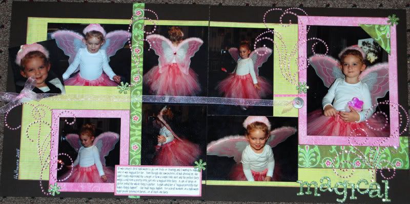
The other layout was double page, multi-photo. I actually liked the original layout so I stared intently at it for a few days before I decided how to make it work. One technique I've learned from various classes is that my layouts are more cohesive when my subjects face in towards the center of the layout. That being the case, altering the sketch was as easy as mirroring it. My large photo and title are on the right hand side. My second twist was to do a Halloween layout using Christmas papers. Yep, those are Prima's gorgeous new Christmas papers, Christmas Fancy. The pinks and greens were perfect for my photos. Linsey loved being a fairy for Halloween.I did a few other tweaks to the general sketch and then I blinged the heck out of the layout. The bling flourishes are pink Say It With Crystals, again from Prima. I fussed with this layout for a while, trying to really get it to work for me. I had half a dozen or so flowers on it and just couldn't get it to flow. It was only when I pulled them off to swap them out with a different set of flowers that I realized the glitter asterisks (American Crafts Thickers) that I was using as flower centers didn't need the flowers after all! They were the perfect accent to pull the bling in line with the colors and the subject.
The title is the same American Crafts Thickers, ribbon is from Hobby Lobby, washer I believe is Making Memories. It's been in my stash for a while. It says "Believe"
Again, click for a larger view -

3 comments:
V, nice layout! Those are some seriously cute photos. And, for figuring out the trick on my maze you get a free ML 0.03. just send me your address.
Marianne
I postes ome of your layouts to the store blog...Hope thats okay. Waiting on your new Bo Bunny ones to go up her (hint, hint)
Okay, I am such a dork and cant spell tonight...sorry. LOL
Post a Comment