Once I have my paper and sketch, I decide what photos from my files will work best. Usually, I have several options to choose from. I pick my favorites that seem to suit the paper the best and print those. I usually print my favorite photo as a 5x7 to serve as the focal point of my layout. The others get printed as 4x6 or wallet size. Don't be afraid to choose several sizes!
At this point, it's usually a matter of just putting everything together. Every once in a while, however, it just doesn't work. When that happens, I struggle. I spend ages trying to "fix" the problem. That's what happened when I started working with these photos. The paper, Bobunny Alissa, I felt was perfect for the photos. My problem was in the sketch. I had done something I never do. I had tied myself to a sketch, so much so that I even spent time in the Cricut Design Studio recreating the side element. I use sketches as a jumping off point, more inspiration than map. The linear design of the sketch became limiting and stifled the flow of the pictures. I couldn't find the unbridled delight of my daughter dancing in the design, so I stopped. I put the layout aside and worked on a different group of photos.
When I went back to the layout, I saw how stifling the design was and set to work trying to salvage what I could of the paper and photos. In the long run, it was mostly a lost cause. My photos ended up stuck to one another and the paper had been cut in long lines, which doesn't salvage well. The only thing I managed to save was the base cardstock, which was a nice chocolate brown and the pink letters I had cut for the title. I tucked the brown cardstock away for another project. The only thing that remains from the original layout is the pink letters.

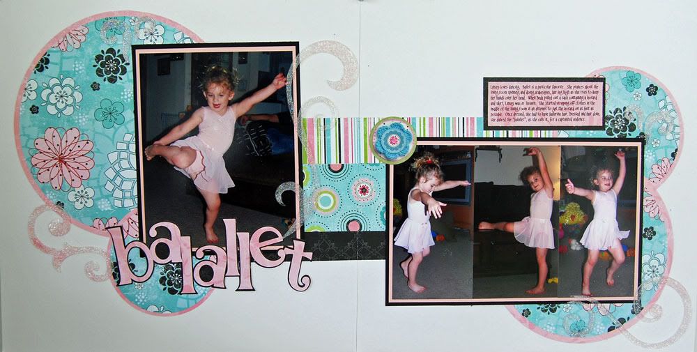
I think you'll agree that this layout works very well with the photos. I like the airy feel of white space in the layout paired with the illusion of movement the circles give. I managed all four circled and mats with a single sheet each of the papers. The pink mats are just rings on the back sides of the solid blue circles. This let me do the mats, the lettering and the journaling block with a strip of paper left over.
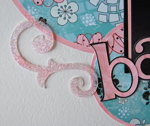
 When it came to embellishing, I wanted something that would add to the light feel of the layout without overwhelming it. I bought a pack of acrylic Bobunny swirls a few months ago as an impulse buy. I wasn't sure what I would do with them. I thought they would be perfect and was fairly happy with the effect when I placed them on the layout. I thought they still needed something however as they seemed to fade into the background. Pink glitter did the trick. I used Making Memories Glitter Glaze to coat one side of the acrylic swirl and dumped on a thin coat of Art Institute Pink Glitter. The glitter gave me the pop I needed while keeping the swirls from being too heavy for the overall feel of the layout.
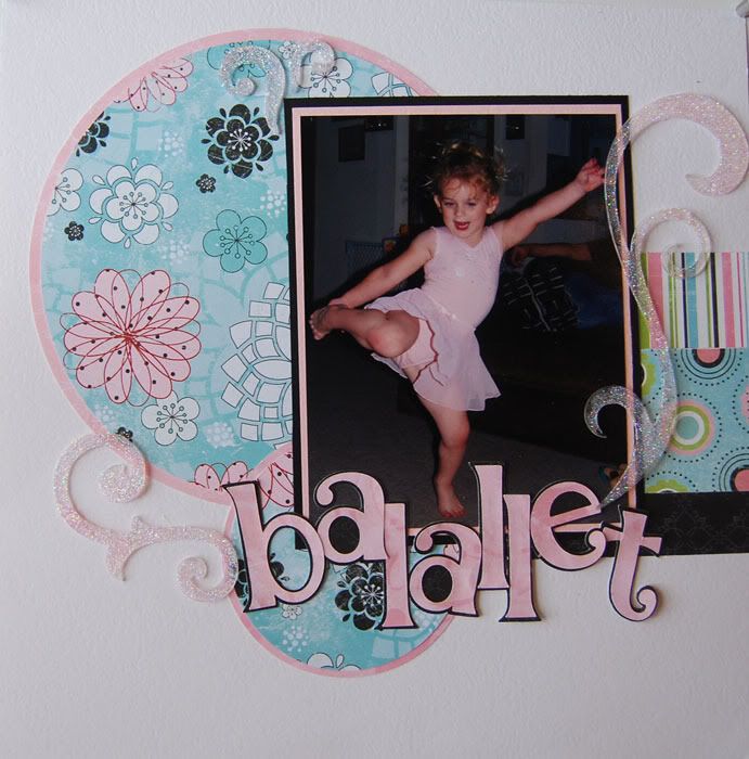
For those of you who prefer single page layouts, here's a close up of the left side. You'll notice that even though the horizontal bars in the double page layout tie the to pages together, they can be a simple stand alone element in a single page layout.

This little moment happened when my parents came to visit back in April. They brought with them a leotard and skirt. My daughter was in heaven. She loves to dance, and ballet is a favorite. She would pull on her the skirt from her Halloween fairy costume and do "balallet". I thought that using my daughter's word for Ballet was the perfect finishing touch.
 Supplies for this layout are primarily BoBunny. I really love their papers. Such diversity and charm! This is from the Alissa line. I used my EK Success circle cutting system for the jumbo circles, BoBunny acrylic swirls and Art Institute Glitter. The title is the Alphalicious font for the Cricut with the fun chaotic styling on the shadow done in the Design Studio. More BoBunny coming up in future posts. I found a layout from when I first got my cricut while I was doing some cleaning. It's a fun, no kid layout, so stay tuned.
3 comments:
Love it! It turned out great. My net is back at work - thankthegoodLord!!!!!! So I'll be back...hope you didn't forget me. LOL
Great cards!!
You always inspires me...
Stunning work...
--
Michell
Home Security Systems no CREDIT CHECK everyone is approved
Post a Comment