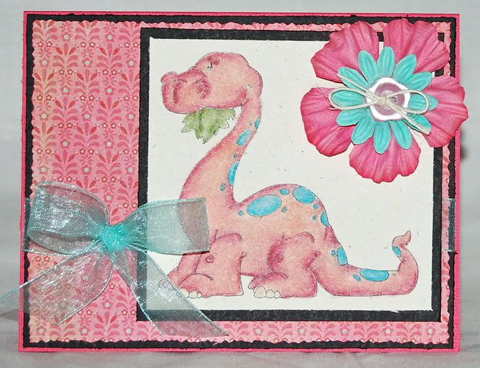
 Right off I'm going to say that this isn't the best picture of the Bronto. The image is totally cute and goes well for boy or girl. I was trying some new cardstock, which has more "tooth" or texture than my beloved Pure Lux. This means when I color it puts more pigment down and sucks up more Zest it. Since the Zest-it is a solvent, it wants to eat into the laser toner I use to print my images when I get too much on there. I had to stop and set the image aside a couple of times to let it dry when I noticed some smudging on my lines. You can't tell on the final piece, even if the photo had been better. It's just something you have to be aware of when you're working.
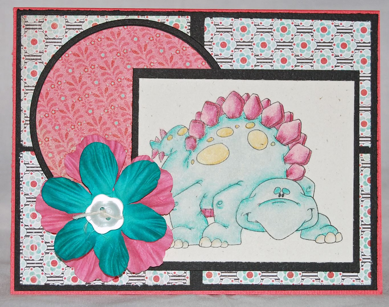
  I do find, as on Miss Steggo here, that the rougher stock makes the final piece a bit more vibrant. This is because there is more pigment on it, but I do like the effect. She's a scrapper, as is the card. She's one of the last cards I put together this week, so she ended up with the scraps from the rest. I used them in a window pane effect behind her and the pink circle was a left over bit from the sheet I used on Miss Bronto.
So what paper did I use for my coloring? This is the new Rustic Vanilla from PaperTrey Ink. Do I like it? Overall, yes. Will it be my regular go to paper? No. I enjoy using it and will do so frequently, but I prefer the smoother surface of the Pure Luxury cardstock. So how does it rate overall in my paper sampling? I'd give it a definite 8. This is in comparison to a 9.5 for the Pure Luxury base weight cardstock. I got both the Rustic Vanilla I used here and the Rustic White, which I'll show more in another post. The vanilla is a very light cream tone and the two look near identical in the package. I actually thought I'd gotten two of the same thing when I pulled them out of the box. Out of their wrapper, however, there is a discernible difference.
While it does have more tooth than the Gina K Pure Luxury cardstock, it is still a nice smooth stock. If you haven't read about it on Nichole's blog, the "rustic" aspect of the cardstock is that it has flecks and bits that make it look more handmade than standard pure cardstock. My printer took to it well and the toner fused to the surface. I mention this because I have had problems with Bazzill cardstock where the toner did not fuse because there was just too much texture. I can't tell you how it rates against the regular PaperTrey cardstock as I haven't tried that. I feel a bit silly ordering up plain white & vanilla cardstock when I have a good selection of Pure Lux ready to use.
I mentioned earlier that I have to use more Zest-it when I'm using the rougher cardstock. The cardstock is more porous and absorbs it quickly while I'm working. It does fine if I'm working in small spaces, but large spaces like my dinos here, were challenging. I used probably twice to three times as much on these images as I would have on the smoother Pure Luxury cardstock.
Okay, I know some of you use the Georgia Pacific cardstock. I do have a supply of this that I normally use for card bases, but I have used it for coloring. In comparison, I rate it at a 7 to 7.5. The PTI Rustic cardstock has slightly more tooth than the GP, but makes up for that in thickness and visual appeal. I found the PTI stock to be thicker and more resiliant to my pencil work. The Georgia Pacific worked, but I tend to have more issues with image smear. The combination of solvent, GP and toner just doesn't "stick" as well as on the other papers. Additionally, the other issue I have with GP is exclusively with my digital images. I do not get a true black when I print on Georgia Pacific cardstock. It prints a very dark grey. This should not be an issue if you're using an inkjet, but it's something to be aware of if you're using a Laser Printer or copier for your digital images.
 I promised in the last post that I was going to set the DCWV papers a side for a while and I have held to my promise here. I broke out my new Basic Grey Urban Prairie pad and used a good 75% of the pad across a stack of cards. You'll see more of it in upcoming posts. I used circle, rectangle and rectangle scallop nesties. Flowers are Prima, colored cardstock is American Crafts, ribbon is Ribbon FX from Hobby Lobby and buttons are once again Creative Cafe. The Rustic Vanilla cardstock and twine in the buttons are from PaperTrey Ink.
Get your dinos at Dustin's Place and don't forget to snag yesterday's freebie! It's a great background for the dinosaurs.
No comments:
Post a Comment