I actually picked up several paper lines, but I needed some masculine color tones and even with its' florals, Abbey Road fit the bill. I pulled out my images and selected some that would fit some cards I needed to make. I went for "Love Bear" a digital image from the House of Mental line at The Greeting Farm and Henry with his cute cupcake from Whiff of Joy. The bear looks a bit mental, doesn't he? I needed a couple of get well cards and he's perfect for my somewhat bent sense of humor. As for Henry, who wouldn't want that cute little mouse on their birthday card?
For card design, I did a standard take on the Taylored Expressions Cupcake Challenge 62 with Henry. It is a cupcake sort of challenge and while you don't have to use a cupcake, he seemed to fit the bill. For my second take on the challenge, I swapped the squares and circles on the design. I really like how it turned out. The last card was put together without a sketch. Sometimes you just have to wing it.
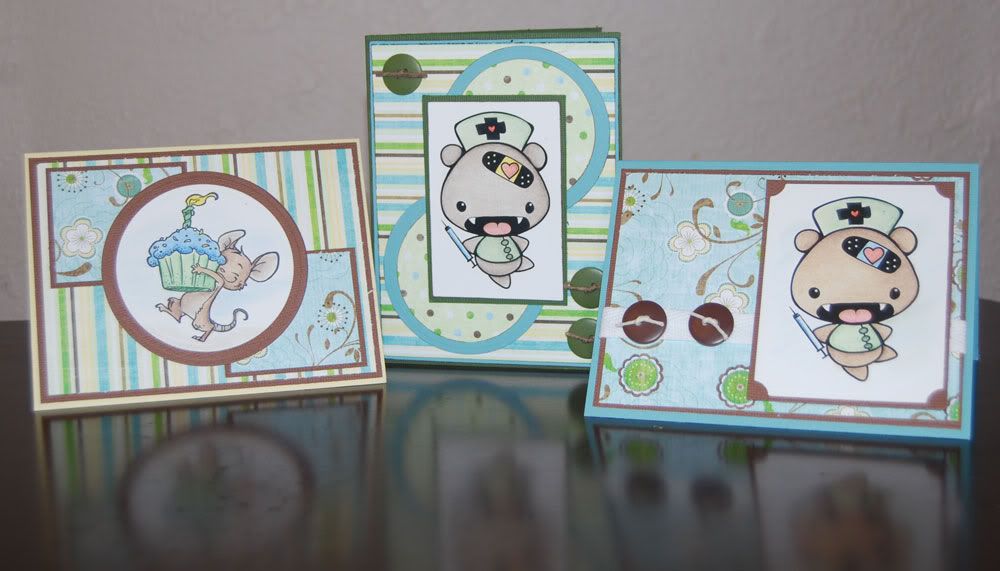
and individually (click for larger)
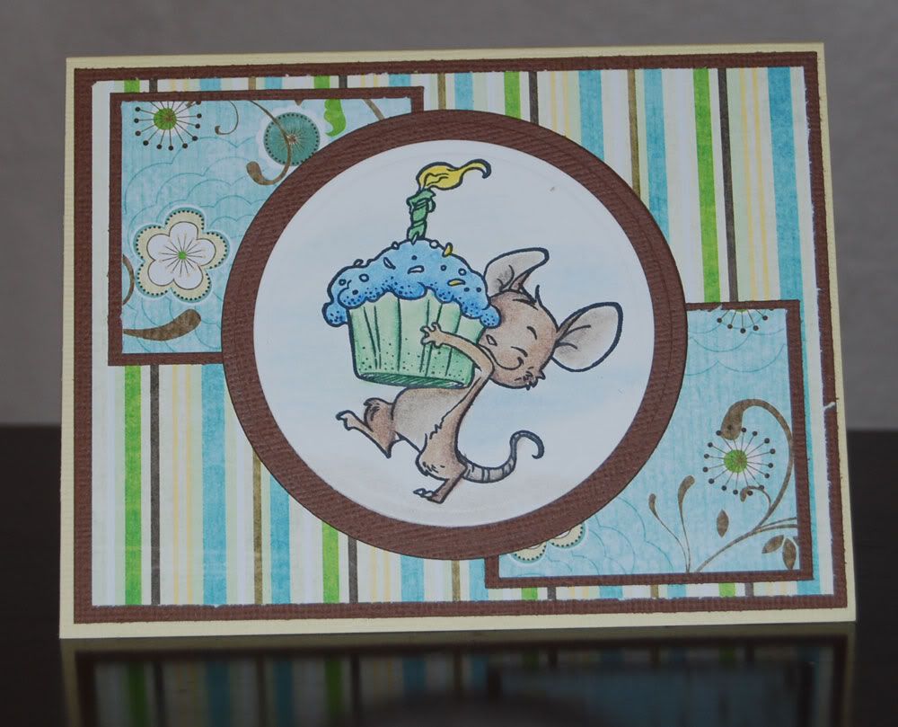 | 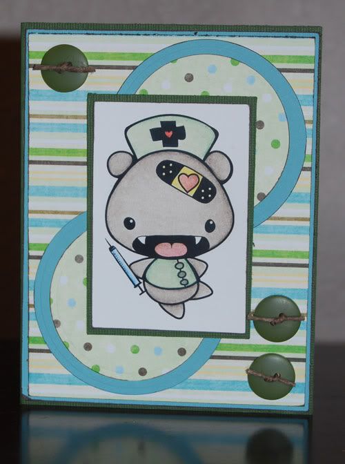 | 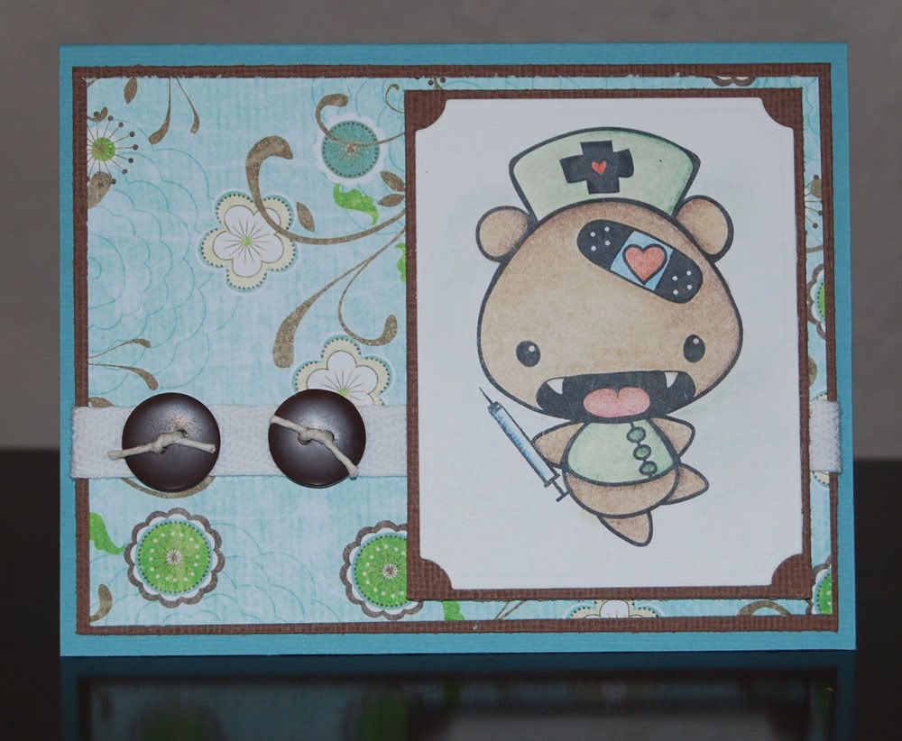 |
I experimented with a bit of background highlighting/coloring this week. I'm not sure if I like it or not. On one image I did, I got a bit carried away and accidentally pulled color from the image into my highlighting. It blended creating a different tone on that portion of the image. Not at all what I was going for. I'm chalking that image up to learning experience and moving on.
For those interested in the colors coordinating with Abbey Road, I used Sunburst Yellow (PC917), Pale Sage (PC 1089), Apple Green (PC912), Dark Green (PC908) Light Umber (PC941), Dark Umber (PC947) and Mediterranean Blue (PC1022). I shaded out my colors with the French Grey pencils in 90% (PC1076), 70% (PC1074) and 50% (PC1072). They aren't in the matching color palette, but I added a touch of pink (PC902) and Scarlet Lake (PC923) for mouths, noses and hearts.
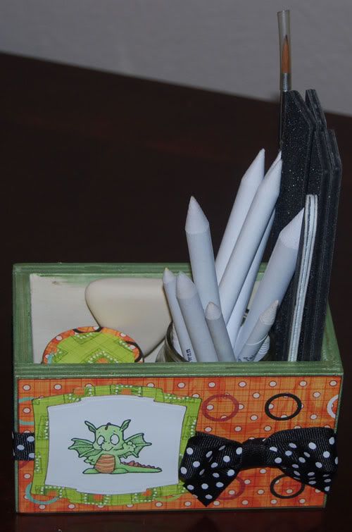
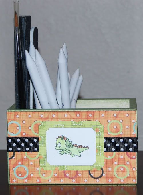
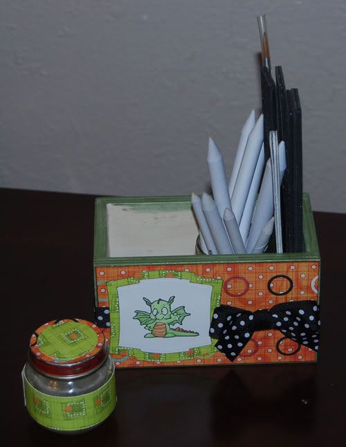
And as a small bonus, my blending box. I altered a wooden box I found in the Hobby Lobby Easter Crafts section. It was one sale 40% so I paid a whopping $1.50 for it. Gotta love that! It's altered with Prima Dude papers, a pair of my cute dragon stamps cut with Nestibilities and tied all together with black & white polka dot ribbon. It's handy to grab, super portable and everything fits neatly inside so it doesn't get lost. Again, click for larger images.
 |  |  |
3 comments:
LOVE LOVE LOVE the box. And the mental bear...he's darling.
Thanks for the sweet words regarding my memo board! I actually picked those up awhile ago at Joanns I think. But try any office supply section for something similar I would think!
You are a wonderful color-er! I love your projects and cards!
Post a Comment