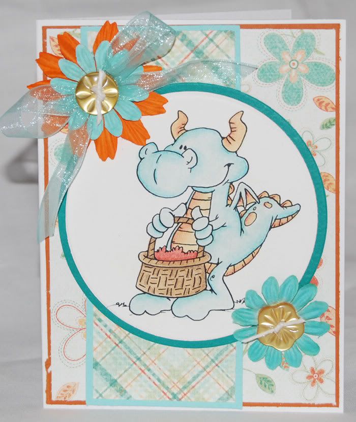
 | On this card, I wasn't sold on this dragon at first. As much as I love dragons, I just couldn't place what was off for me. I went ahead and printed him out, though. In a conversation with my buddy Becks, she pointed it out to me. His basket it empty! Once the problem was pinpointed, he took on a whole new personality to me. He's a very sweet little guy. He now adorns the front of a great little "Miss You!" card. In his next appearance, he'll be pointed the other direction and featured with the dragon holding a hatched egg from my last Dustin post. I think together, they'll make an excellent long card...perhaps for a baby shower. |
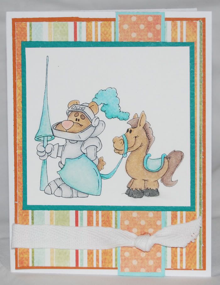
I'm short guy cards at the moment, so when Dustin posted his little knight, I knew I needed him. Here's another that I could have tweaked up my colors a bit and added in some of the orange, but I really like how he's all done out in blue. Looking at it when I was writing up this post, I realized that he probably would have popped a bit more if I'd done a dark card base rather than the white. He looks pretty good on the white, but next time I'll probably try him on something else.
| I had a lot of fun with shading on the armor. I used the cool greys in my Prismacolor box. I started with 20% and worked that with 50% and 70%. The challenge is deciding where all the shading is going to be while trying to keep it from looking like he's wearing dirty armor. I nearly added some metallic silver, but stopped myself at the last minute. I do think he needs a shield design, though. The blank shield bugged me when I was coloring it up. Knights need a good emblem on their shield like a crest or something to make their opponents think twice about smacking it. Dustin's got a couple of great "manly" dragons in his Etsy shop, so I need to figure out which one is going to be best on my knight and snag that with my next order. |  |
A few of you have asked if I would do before and after photos of my coloring/blending. I've done one a few weeks ago when I was starting my experiments with baby oil. It's a bit problematic as when I said in my last post that I'm a lazy artist, it's not entirely true. My style of coloring/blending involves lots of layering of color and blending and shading and a bit more color and perhaps a bit more blending....I can easily do a quick shot of my "before" as I tend to lay down all my base colors before I do any blending. It's the after that I think would probably disappoint. I have a couple of options at this point. I can do a more step-by-step photo shoot. This requires me to remember to stop mid process and take photos. Once I really get going on an image, about the only thing that stops me is a crying boy, demanding food or nap. :) The other is to charge up the Vado HD and do a video tutorial. I need to charge the Vado either way, but I've never done a video tutorial and I'm not sure how it would all work out. As I plan to play more with the Zest-it this weekend, I'll see what I can come up with.

1 comment:
You have just been STAMPED! You have such a CUTE blog and we see you are interested in digital stamps....so visit our blog to pick out your free stamp!!!! doodlepalace.blogspot.com
Post a Comment