before - 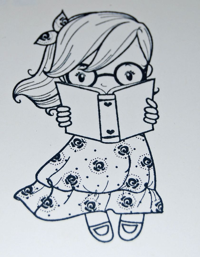 | after - 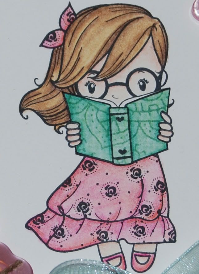 |
Meet Wendy from The Greeting Farm. She's part of the Never Ever set. I bought the set just for her after a couple of months of patient waiting. I fell in love with her the instant I saw her in a sneak peek on the Greeting Farm blog. There are very few things I love more than paper crafting. Reading is one of those things. I've been an avid book worm since the day that I saw Spot run. Throughout my life, I've read more books than I can possibly count, often three or four at any given time. Lately, I haven't read much beyond Robert Lopshire's "Put Me in the Zoo". That book was a childhood favorite and while I do enjoy reading it to my 3 year old, I do miss books with fewer pictures and more words. I do still carve out time as I can to read, but I don't get to read like I did before she arrived. Still, this image is very evocative of my childhood.
A couple of disclaimers before I dive into the actual tutorial part of the post.
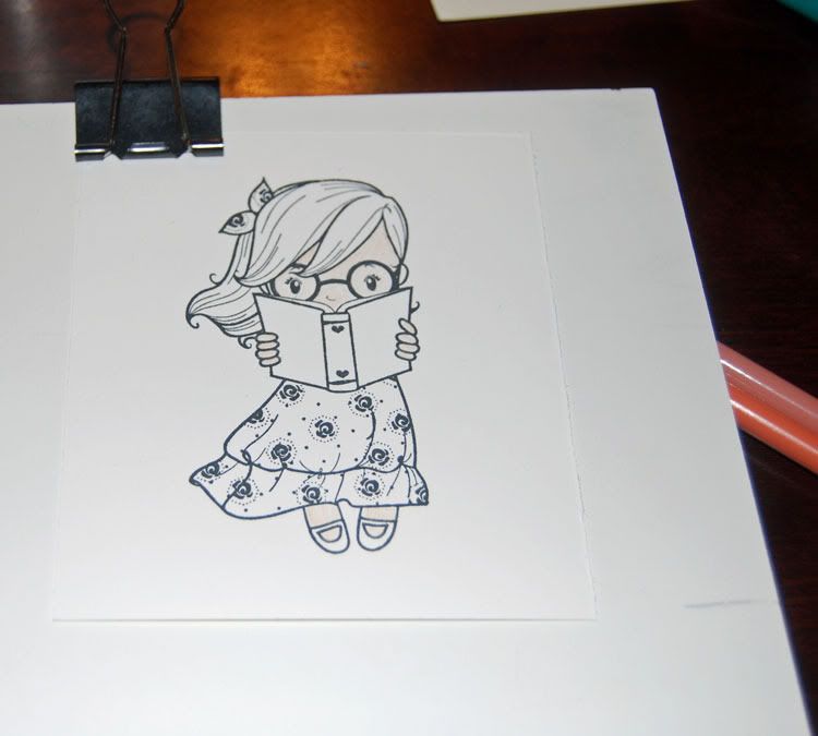 First, I work off of an 8x10 piece of gessoed art board I picked up at Hobby Lobby with a binder clip to attach my work to the board. It's small and very portable, but not too small that it makes my hands hurt when I'm trying to work. On the down side, it means that most of the time when I was shooting pictures between steps, it was at an odd angle on my knees. This left the bottom edges of my photos a bit blurry. Not blurry enough to affect the overall image, but blurry all the same. Second, in order to keep this post from stretching all the way to Texas, I've scaled down the images. The images are available at large size (often 750 pixels wide), you just need to click on them for the extreme closeups. And finally, I did get a bit distracted a couple of times, so if I seem to jump ahead without a picture, it's because I forgot to stop and take one.
Getting started...I use Gina K's Pure Luxury Baseweight for pretty much everything I color. I've done a little experimenting with craft, but I'm not pleased with the results at this point. That's another post. I used white for this project. In general, when I get new images, or run low on things I want to work on, I take a morning and stamp a couple of sheets with images. I trim them down, leaving enough room for nesties work at a later date. These all go into a pile, so I can snag one and color without having to stop between images. I use Memento ink for anything that I'm going to color. In this case, Tuxedo Black.
 While I generally do all my base colors at one time, I do make an exception for skin. I have a bad habit of pulling in outside colors when I go to blend my skin areas, so now I make a point to do those first. I'm still experimenting with color tones for faces. Up to this point, I've been pretty much specializing in pasty white girls. As part of my birthday present, my DH got me the 12 new primsacolors, bringing my set to the full 132 available. In those colors were two that I'm already loving for faces. Here I've started by coloring out all the skin areas in 1093 Seashell Pink.

Once that's blended smooth, I sketch in my shading color. Here I'm using PC1092 - Nectar. Notice I'm not making any effort to be exact about where I put the color. It's in the general area I expect to see shadows on a face. As she's reading, most of the light would be on the pages of the book, so I decided that the light was over her left shoulder. I put my shadows along where her hair is overlapping her face and off to her right. I did not shade along the top of the book, as the light would be bouncing off the pages of her book onto her face.
 For the most part, I don't use tortillions. They're small and not very comfortable to use. I do make an exception for skin. Most of my "skin" areas tend to be quite small and I've found that the extreme tip on the tortillion is excellent for blending in my shading in those areas. I rarely clean/sand these as that's pretty much all I use them for.
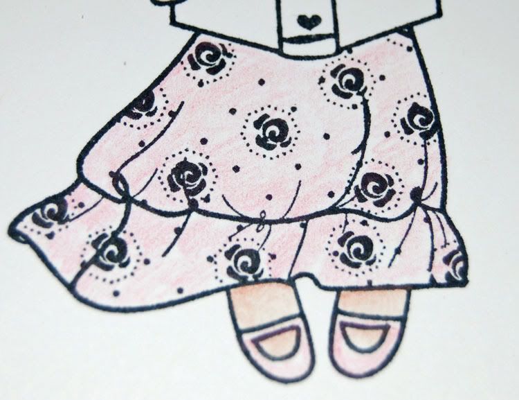
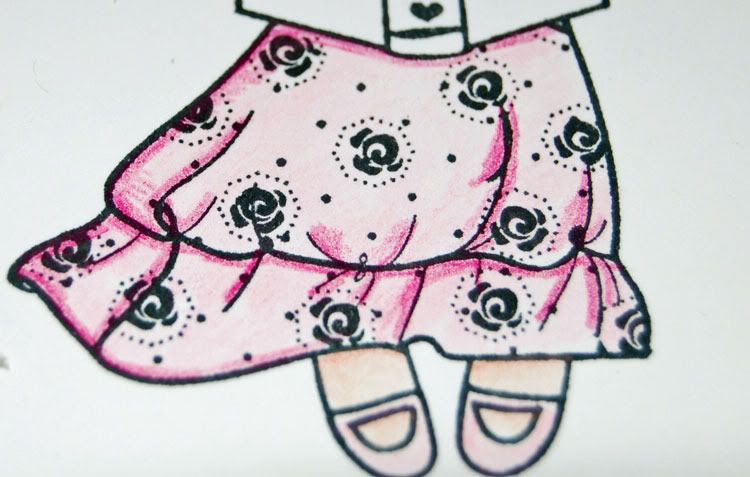
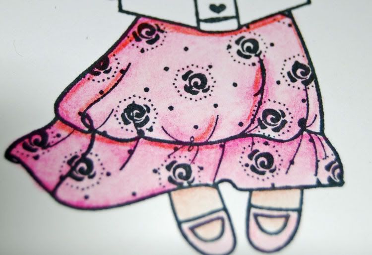
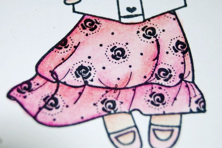
With her face done, I go back and add in all my base color. I really don't have a specific direction from here. On this image, I chose to work on her dress before her hair. I started with PC929 Pink as my base color. That is blended smooth and then I added PC930 Magenta for my shading. Again, I kept my light over on Wendy's left, so I didn't shade along that side of the dress. Once that was blended in, I found the dress to be a bit too pink for my taste and some of the shading wasn't quite as intense as I liked. I don't have a picture here as I was trying to decide if I wanted to pull in more of the magenta or not. I opted to add in PC923 Scarlet Lake to tone down the pink. Notice that I didn't put it everwhere. The red is a pretty intense color and I just wanted to tone down the color and darken some of the shadow areas.
 |  |  |  |
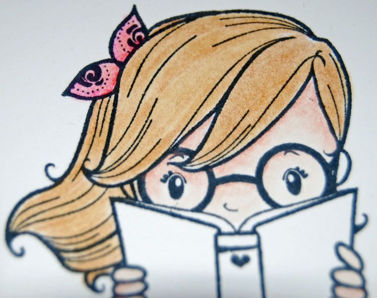
Next up is hair. One thing I really love about The Greeting Farm images is how the hair is drawn. I can easily see where I want highlights and low lights. When I do my base coloring on hair, I don't try to get my color even. I intentionally end up with areas that are lighter and others that are darker. What's more, I don't try to even out the color when I blend. I just smooth out the lines some. I don't blend hair to completely smooth. I like the textural appearance that leaves in the long run. My base coat here is PC1082 Chocolate.
 |  |
After blending the base color, I go back and add in mid tones. I pretty much followed the stamp lines on this image, adding color along those lines or into areas between the lines that I felt would give her the most natural looking hair. Now here's the most important part...do not blend this into the whole head. Just blend very lightly so that the harsh lines of color smooth out. If I had blended the color completely, I would just end up with a darker head of hair all over. You'll have some lighter areas, but they would be fairly small. Her hair looks pretty good here and I could easily have stopped, but I felt it was missing some shading.
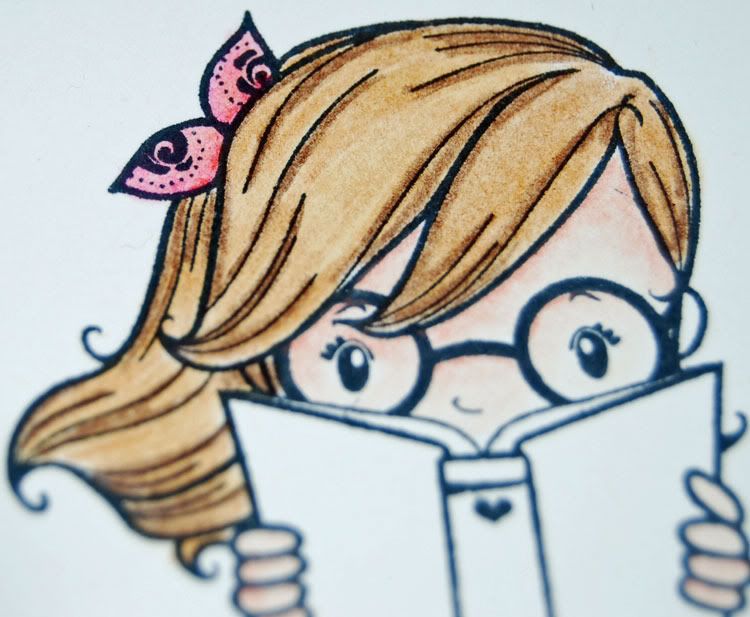 |  |
I went in with PC947 Dark Umber in just the areas where I wanted shading. Where hair overlaps hair and where book overlaps hair, once again blending very judiciously. I don't want the shading to be obvious, I just want it to give the hair added depth. In the end, I'm pretty happy with a rich brown tone. I find doing this tone is the easiest for me, so you'll see it a bunch in my images.
 |  |
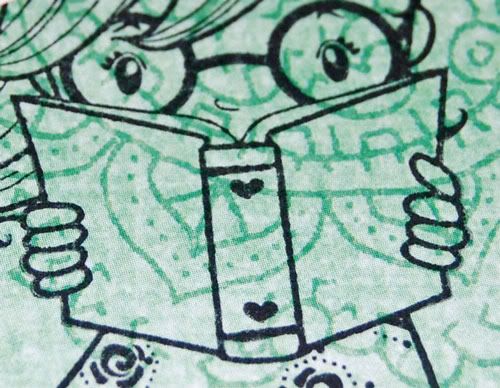
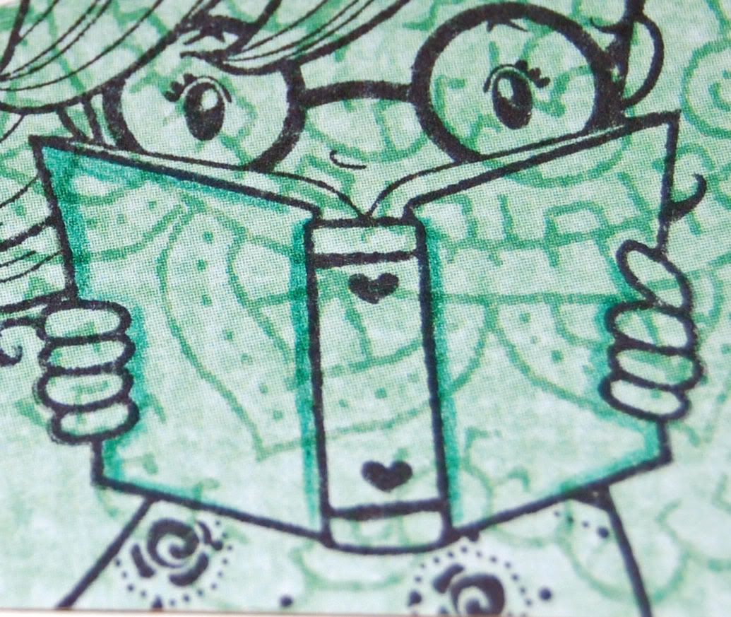
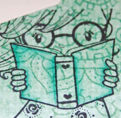
I decided before I ever started coloring that I really wanted to paper piece the book jacket. I could have colored it and been happy with it, but I had some great patterns in the My Mind's Eye Bloom & Grow Grow papers. The back side of one of the more vibrant prints was a very nice tone on tone paisley that I knew would work great. Just because you paper piece instead of plain coloring doesn't mean you can't (or shouldn't) add some shading to the paper piecing. I added shading along the spine, around her fingers and on the edges of the shadow side of her book in PC905 Aquamarine. I blended with a very light hand as the paper wanted to suck the Zest-It right out of my stump. If you're going to color/blend on a paper piece, test a small area that you're not going to use to see how your blending fluid of choice reacts. I sampled both baby oil and Zest-it. The baby oil wanted to stain if I wasn't very careful.
 |  |  |
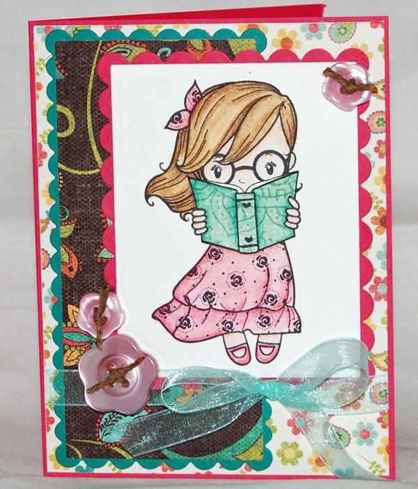 I trimmed out the paper piecing, ran a black pen around the edges to keep them from showing and then glued it in place. I made sure to just trim the book cover so that my pages would stay white. I'm pretty happy overall with how she turned out. I would have been happier if I had been able to find my Diamond Glaze so I could have added a bit for lenses on her glasses. I used some of my new nestabilities to make up the card. The paper is from the Bloom side of the My Mind's Eye Bloom & Grow line, which coordinates perfectly with the paper piecing even though I used the other half of the line for that. I do love My Mind's Eye! The cardstock is Prism, the ribbon is Ribbon FX from Hobby Lobby and the flower buttons are Creative Cafe.
I hope you enjoyed the tutorial!
11 comments:
Thanks for sharing. I am just learning how to use Prisma pencils and OMS. This was very helpful!
Beautiful colours on this, hugs Pops x
Wonderful tutorial....incredibly detailed!! Your card turned out gorgeous!! TFS
XO
Cindy
thank you so much for doing this!! so you add your base - blend
then add shading and blend?
i have been skipping that first blend step!
zest it is on my list to buy - i love the baby oil but it does want to stain sometimes!!
Great job on the tutorial!!
Plus, the image is adorable - of course you did a great job coloring :)
Thanks for putting it together !!
Congrats on the DT for Dustin Pike! I'm looking forward to working with you! :O)
Congrats on becoming Dustin Pike's DT.
I can't wait to work with you :0)
Your blog is fantastic.
HUGS
Ri
Fab tutorial this will really help me!
Thanks
Hugs
Lana x
This is a wonderful tutorial, I learned so much! THANKS!
Thanks for taking the time to do this!!!
Thank you for writinng this
Post a Comment