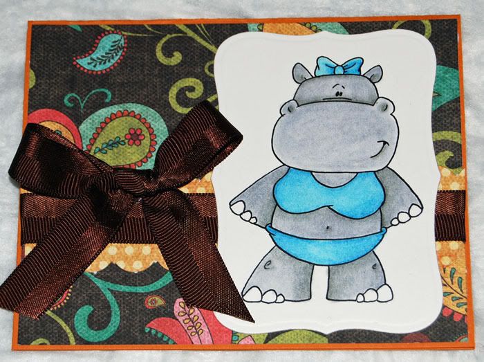
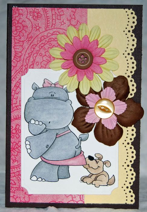
Or maybe its just these cards!
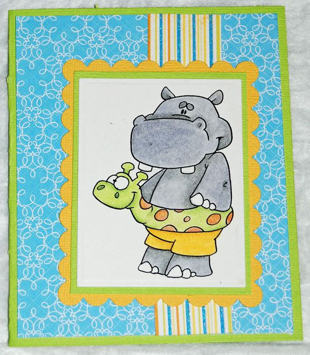
I want to thank everyone who posted such lovely comments on my blog. I do hope you'll come back and visit me some time. Winners of the hop will be posted on Dustin's blog very soon now. While you're waiting, I have a couple more hippos to share with you. I will say that Dustin's dragons are my all time favorite of images, but these darling hippos have quickly found their way into at least the top three. If you're new to my blog, let me say that I am a devoted pencilist. Until very recently, Prismacolors held my heart, coming in as my number one coloring choice. All that changed when the hubs rocked Valentine's day this year. He gifted me with the complete set of Derwent Inktense pencils. I am in love! These darling hippos were done entirely with the Inktense pencils.
Derwent says about them "Pen and ink offers strong, intense colour combined with a translucent effect. Now you can enjoy these distinctive qualities in an easy to use pencil. Inktense has a highly blendable texture and comes in a range of 71 jewel-like colours, plus a non-soluble outliner which allows you to draw outlines that are permanent, even when water is applied. Apply pure, vibrant dry colour then wash the pigment out completely to leave an ink-like effect. Once dry, the colour is permanent and can be worked over with other media. The possibilities are endless, the results stunning." I say, "these pencils totally rock". Mine is a bit shorter than theirs, although, there's has a lot of good things to say about these awesome pencils.
I will say that the greatest impact comes when using a wet brush. The colors seem to leap off the page to give you a big vibrant kiss of color. That being said, these pencils are also amazing when used with Zest-It as I have done here. For someone who thought that 132 colors could not possibly be enough variety, I've been incredibly content with a mere 71 colors. Not that I wouldn't be opposed to a few extra colors here and there. I highly recommend giving these pencils a try. I got mine at Dick Blick, as they seem to have the best price around for the set. I paired them with a nice Global leather case made for 72 pencils. These pencils are chunkier than your standard prismacolors. While they do fit in the case, they are seriously snug for the first five or so uses of pulling the pencils in and out. After that the leather and elastic relax a bit and they're easier to get in and out.
A quick run down of supplies here. Obviously, Derwent Inktense pencils for the coloring. They done on my favorite Gina K. Pure Lux cardstock in base weight. I'm continuing to shop my stash for patterned paper and cardstock. The first card was done with the Citrus Die Cuts with a View stack, the other two are done with My Minds Eye Bloom and Grow collections. I believe both are from the Bloom side. Expect more stash shopping from me in months to come. I've got such a huge stash of papers that it seems silly to buy new! I'm learning to be frugal with my supplies for a change. Not to mention no local store to browse through!
Apr 24, 2011
Apr 21, 2011
Hip Hop to the Blog Trot!
Welcome Dustin Pike fans to our second blog hop. This is a party you will NOT want to miss.
If you aren't arriving from Jenn's blog, be sure and go back to the beginning so you don't miss anything.
We are delighted to share with you some of the amazing images Dustin Pike, Illustrator of all DoodleDragon Studios designs. This day marks the anniversary of Dustin's 2 years on his blog and we, the DoodleDragon Crew want to show you some of the fabulous Blog-iversary images you can get for a fantastic price, offer is good for a limited time, so go look. Dustin is so generous with his images. If you are new with digital images you will be happy to hear that they are easy to use, store and print out. You can resize them and then print on your favorite paper. Dustin not only gives you Black and White images but sometimes even throws in the colored versions too. You can locate these images HERE, as well as many more. 200 images plus for ONLY $20.00 USD during the blog hop ONLY. See Blog Hop details below.
This is what I have created with a few of the images.
***If you purchase the Blog-iversary images BEFORE Saturday midnight (MTN TIME) you will receive over 200 digi's for $20.00. AND if you bought the April 7th release there is a 50% off code in the file that would make the blogiversary 10 bucks...Thru Saturday ONLY. After Saturday night they get split into sets and will be available at a different price. Don't wait, get in on the Blog-iversary NOW.
Hop Details:
Comment on EACH one of the stops along the way for 10 chances to win. Each one of the Design Team will be drawing a name and announcing a winner from our commenters. We will post the winners on Sunday April 24th and you will have till the following wednesday to email dustin with your name and shipping address for your prize delivery.
Every blog along the way has a special word. Collect the words on each blog to make a sentence and then at the end of the Hop email the sentence to Dustin_Pike@yahoo.com in order to be eligible for the prizes. What is the prize you ask? You will receive an original piece of artwork, hand drawn, colored and signed by Dustin Pike. In all your excitement don't forget to pickup YOUR Blov-iversary images at Doodledragonstudios.com. Blog Hop starts today and goes until midnight on Saturday, April 23rd, mountain time.
My special word is "DRAGON", as in Dudley Dragon is my favorite of all the DDS images!
Thanks for stopping by. Now hop on through to your next stop, Ri at Coconut Lounge Creations!
Lost? Miss someone along the way? Check out everyone's blog:
Dustin http://dustinpike.blogspot.com
Jane http://janesboxofcolours.blogspot.com/
Ginny http://my5bratzcreations.blogspot.com/
Lelia http://greengoddescreations.blogspot.com/
Kerri http://bigsmilesfromkbear.blogspot.com/
Gramma http://grammascards.blogspot.com/
Charlotte http://designsfromwithin.blogspot.com/
Jennifer Dove http://just4funcrafts.blogspot.com
Veronica You're here!
Rikki http://coconutloungecreations.blogspot.com/
Apr 10, 2011
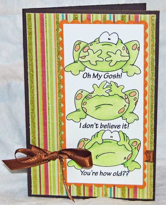
How Old???
If you've read my blog for any length of time, you know that I like pretty cards with very tongue in cheek sayings on the inside. This time, I went for a slightly different angle. I laid it all out right on the front of the card. These silly little “no evil” frogs caught my attention as soon as Dustin put them up for the March Membership. Why most No Evils keep their tongues in their mouth, mine come right out and say what they're thinking. They are shocked and amazed at the age of the card recipient. There are times when, of course, we should speak no evil and other times when we should let it all hang out and just tell it like it is.
For this card, I combined and reduced the three frogs so that they would fit comfortably on what turned out to be a 6” x 4” card. This won't fit a standard envelope, which is fine for me. I prefer to tuck my cards into the ribbon on a package or basket of goodies rather than hiding behind an envelope. If you want something more standard, you'll want to keep in mind the finished card size when you group the images and text.
So now it's up to you to tell it like it is, either nicely or with a bit of sass. Hop over to Dustin's blog and join in the Birthday Card challenge! It's his blogaversary month, so check his site regularly for fun new releases and exciting things this month.
Supplies this time once again came straight from my stash. I've come to the realization that I have too much stuff and it's time to use some of it up rather than buying new. The striped patterned paper is from a DCWV fall stack. The glitter and ribbon, courtesy of Really Reasonable Ribbon, add a bit of pretty to an otherwise sassy card. The image and scalloped mat were cut with Spellbinders Long Rectangles/Scalloped Long Rectangles Nestabilities dies.
Mar 4, 2011
Let's Talk Coloring!
You may have seen this on Dustin Pike's blog. If you've wandered over from there, welcome! If not, go check him out!
There are so many different media choices available to paper crafters these days. Copics are one, but frankly, I'm not a fan. I like my pencils and I like to think I get pretty decent results with them. During a recent DT discussion, one of my DT Peeps complained about his choice of coloring medium:
“I have Prisma watercolor pencils and I use OMS. For some reason, the edges of the images always have more of an outline look to them (does that make sense?) Not a nice blend like the Copics. ”
It is the number one complaint I've heard about the wet blending technique with colored pencils, also known as Gamsol Technique on Splitcoast Stampers. I tried it when I was first looking at pencils and decided I didn't care for the way the final image looked either, so I went back to early art classes and mixed what I knew worked from watercoloring with the OMS techniques I found online. Now I love the final results. You can love your results too. Getting from here to there is as easy as one, two, three! Check out these monsters.
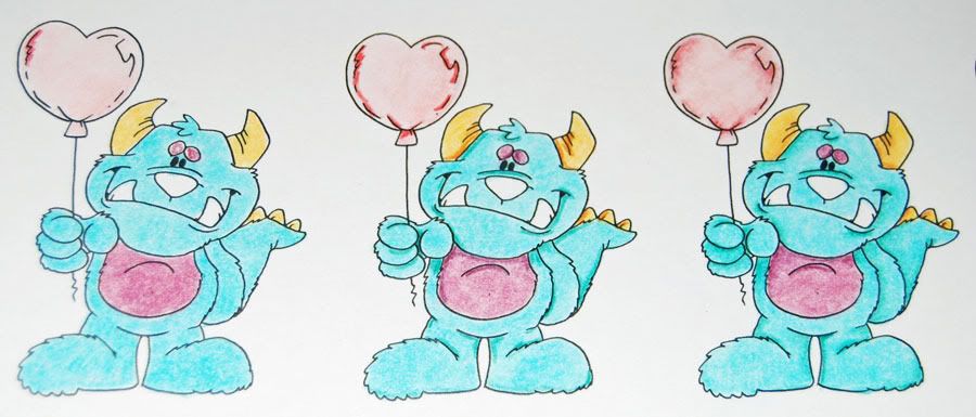
The first is colored straight, no blending. The second is blended and the shadows scribbled in, the third is ready to cut and make into a card. I missed a spot when I blended out the last monster. See it? I caught it before I made it into a card, though. The totally cute Monster is from Dustin's December Membership offering. He's a Members Only image. Membership totally has its privileges! Check out the membership information here.
When broken down to three simple steps it looks pretty easy, right? Think about it this way. I treat my pencils something like...well...copics. :) I lay down a light even layer of color in each section, blend that smooth, then go back with a darker tone and scribble a bit into the lighter areas, blend that out. Repeat if I'm using a third, darker tone. I find that this style of coloring and blending gives me something that falls about half way between watercoloring and copics. Easy as 1, 2, 3! Let's take a closer look at each monster.
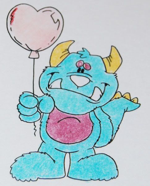
Monster 1 here was colored over the entire surface. Nothing fancy. Just go back to your grade school coloring roots and dig in. It doesn't have to be smooth and perfect. The blending will take care of any rough patches. You do want to make sure that you have an all over color.
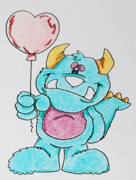
Monster 2 has this layer blended out. Notice how smooth and even the color looks when compared to the first one. I've picked out a pencil tone that is darker than my original color. Working just in the areas where I want shadows, I just add a couple of quick lines or a scribble.
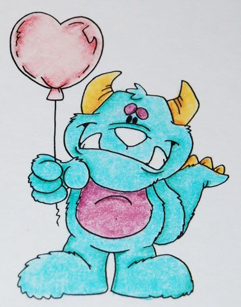
Step up to Monster 3. All the scribbles and lines from Monster 2 have been blended out and smoothed into the first layer of color. In this case, complete and ready to make into a card. I will say that I was not at all pleased with how the balloon came out. The colors I chose for it were simply to light next to the vibrant colors of the monster. You'll notice in the final card that I covered them up with heart shaped chocolates.
Before I tackle some of the questions that I've gotten, with the help of the rest of the design team, let me show you the difference just a bit of shading makes. The monsters, colored and blended before I went through and added the shading came out pretty cute. In fact, I left one unshaded just to show you that if you aren't comfortable tackling that part of this technique, you can still get good results without it.
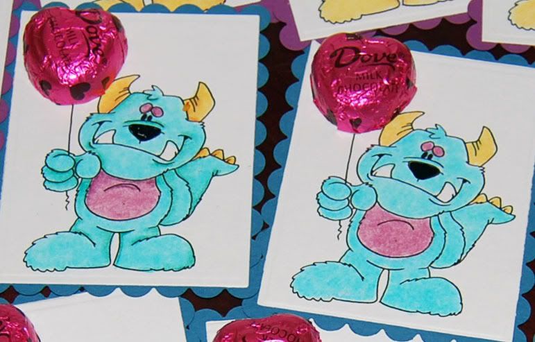
The Monsterlicious Valentine on the left was blended and shaded as I mentioned here, while the monster on the right didn't get any shading at all. The one of the left has that pesky leg still not blended out. Good thing I took pictures or I wouldn't have seen it until I was packing them up! Personally, I like the extra bit of pop that shading gives to an image, but it's up to you on how far you want to go. The design still looks good without it.
Okay, how about some common questions and answers:
1. Do you “pull” the dark color into the lighter color? Or do you just swirl your blending stub in the area?
The answer is "yes". Sometimes I swirl the dark into the light, other times I pull it in. It depends on the area and what I'm blending. With hair I almost always pull in varying length strokes to give that sort of texture to the final piece. For faces, I nearly always swirl. For the rest, it's more of a combination of the two, following the line of the image from where I want the darkest part of the shadow to the lightest part. It's one of those things that takes practice to see how the final product is going to look.
Doing the color on color style of color/blending, you'll want to use a lighter touch on the paper stumps. If you're using a good OMS and a good paper, you shouldn't need to forcefully push the color around.
2. What do you recommend for blending stubs?
These are the pencils and stumps I used on the monsters. I just got a pile of the more grey toned stumps that are stamped China instead of Taiwan. I've read people saying one is far better than the other, but to be honest, I can't tell a bit of difference. I'm pretty sure that if you browse through my blog of images, you can't tell the difference either. They feel the same to me and the results are identical.
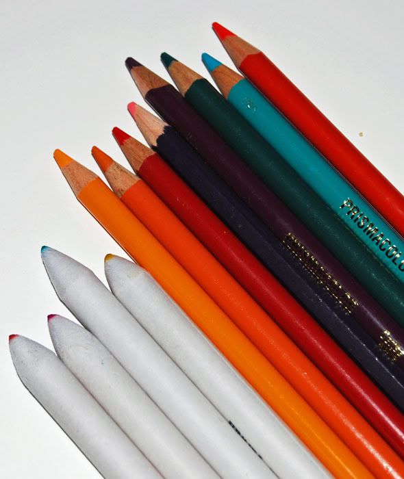
3. I’d like to buy the stumps in bulk, but it seems my Michaels just has three or four in a package.
Up until a Valentine's extravaganza from the hubs, I bought my stumps like you. They arrived in bits and dribbles whenever I was in Hobby Lobby or Micheal's. For the white, Taiwan made ones, that is the only way I've seen them sold. If you want to try the grey ones, they're available in bulk from Blick Art Store.
The only thing I've noticed with them is that because they are a different, cheaper paper than the white ones, they soak up the OMS faster. Not a problem, just a note. On the up side, the small ones from them are smaller even than the collection of Tortillions I have and they work far better for blending in those tiny little spots that seem to crop up in just about any image.
4. What do you use to clean the stumps? I’ve been using a nail file (sanding block type thing).
Nail file. :) I have a collection of 4 I bought at Sally's Beauty Supply nearly 2 years ago. They're wide, 1 1/2 inches or so, made for filing acrylic nails, so they have a coarser grit on one side than you'll get on a regular file. After 2 years of hard use, I'm just now getting to the point of having to replace them. When they get clogged with paper fibers, I rub them on a piece of denim. A scrap of jeans my oldest monster put a bunch of holes in before she managed to out grow them. There's something about the surface of denim that grabs the paper out of the sand paper, leaving you with a clean surface on your files without wearing down the file.
5. What do you use to blend? I've tried OMS but it gives me a headache. (I've also heard that some people say it has a faint, unpleasant smell)
There are lots of alternatives to OMS for blending. You can use baby oil, mineral oil, I've even tried olive oil. What I prefer and use is a product called Zest-It made of orange oil. It's eco-friendly, which OMS is not. The same goes for little monster friendly. You shouldn't go and drink it, but I'm far less worried about the occasional finger dip than I would be with OMS.
I buy it out of England. They don't sell it in the US. I bought this one 2 years ago:
http://www.jandtsartandcalligraphy.co.uk/online-shop/proddetail.php?prod=250pb
Expect it to take around 2 weeks to arrive on their standard shipping offering. Shipping isn't cheap, but as I said, that's lasted me 2 years and I still have quite a bit in the bottle. Also, expect your post people to be grumpy about receiving it unless they've updated their MSDS labeling in their shipping documentation. It is worth the wait and the displeased post carrier. There's no chemical smell, only a faint orange scent and it is the very best thing I've used to blend out my pencils.
I store it in this adorable container:
http://www.stanleysupplyservices.com/product-detail.aspx?pn=121-647&ref=base
Which is manly enough for even my DT pal Ted while still being cute enough for me. Add a strip of paper and up the cute factor. Not to mention the fact that it's easily $10 shorter than most glass pumps on the market.
To use, just push down the top. The Zest-It puddles up in the top for dipping your stumps. The Zest-It will gradually drain back down into the container. No muss, no fuss. I had a wooden basket I bought on after Easter clearance a few years ago. I took the flimy metal wire handle off, gave it a coat of paint and added in some paper and a cute dragon. Not a Dudley, but one of the oldest stamps in my collection. That little guy is at least 15 years old!
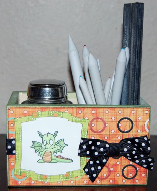
The box neatly holds all of my blending supplies. The solvent pump, stumps and files. The stumps are tucked into a baby food jar too keep them from wandering all over the box. It's a tidy solution to keeping everything together and the little monsters know not to play with the stuff in Mama's Toybox. Here's a top view with the solvent pump open.
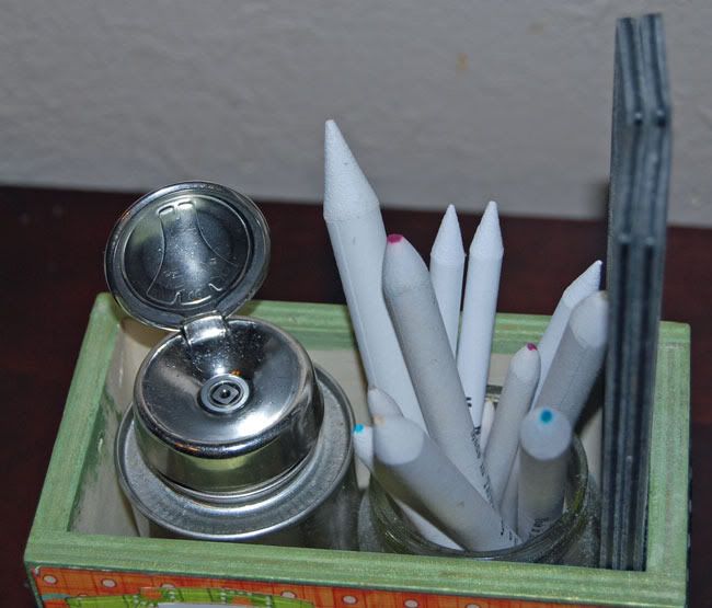
6. I've heard the new Prismacolor pencils made in Mexico don't blend. What other pencils should I try.
Okay, I've heard this and frankly, I've had a very hard time believing it. I've tried quite a few brands and types of pencils and I have yet to find a pencils that would not blend. That includes watercolor pencils and your standard #2 graphite writing pencil my monster uses for school. I don't have any pencils manufactured in Mexico so I can't say for sure what the problem is with the people who have reported it. I know it has scared a few people. If you're concerned, try Derwent pencils. They're very proudly made in England and I've had great results with them.
That being said, I do have a couple of pencils that do not blend as nicely or as smoothly as others. One in question is Mahogany. The purple tone on the monsters at the top. It blends, but often reluctantly. To get the results I want, I find myself using more Zest-It and a lighter touch. If you're hearing a rubbing/squeaking sound of the stumps on your paper, you're rubbing too hard. Go back, get a bit more blending agent and try rubbing not quite so hard. You might be surprised with the results.
7. What paper should I use? I don't want to invest a whole lot of money.
The paper you use will make all the difference in your results, particularly when you're starting out and unsure of how to get the results you want. That being said, I've colored and blended on everything from good Gina K cardstock to watercolor paper. The smoother the cardstock, the easier it is to blend.
Best bang for the buck is Georgia Pacific cardstock available at Wal-mart. It's a decent paper with a good surface. While it's not my go to paper, when I'm doing something like 22 Valentines for the oldest monster, it's worked out fine. For my day to day and go to paper, however, you just can't beat Gina K's Pure Luxury Base Weight cardstock. It's smoother and I really like how the color seems to float on the paper when I add Zest-it. Remember that mahogany pencil I mentioned above? I have far less problems when I'm using Pure Lux stock than when I'm using anything else.
8. What about printers for digital images?
Okay, here I'm going to stop. I use a laser printer so I print and go. I don't have any experience with ink jet printers. Some inks may need to dry over night and be heat set before blending. If heat setting doesn't work for you, take your sheet of printed images to a copy shop and make a copy. Copy machines, like laser printers fuse toner to paper at around 600 degrees as part of the printing process. This pretty much takes care of your heat setting. Even with my laser printer, I occasionally run into problems if there are lots of lines in an area I'm trying to blend. You're blending with a solvent. If you have problems, try staying away from the lines as best you can and if the image still gives you fits, try a spray fixative over the image or a quick burst of hair spray to seal it off.
I hope this addresses any questions you may have with wet blending colored pencils. If you want to know something I haven't covered here, post a comment and I'll do what I can to get you an answer. My best piece of advice is to try it and play around with it. Most of all, have fun. If you don't enjoy it, then it's probably not for you.
Feb 27, 2011
Spring has Sprung?
I only have to step outside my door in the chilly, misty, blustery day and I don't believe that Spring is anywhere close to Oklahoma. To be honest, I don't mind at all. I'm a bit of a polar bear. Give me a couple more weeks of snow and I'd be one happy camper. Sadly, the gusty winds that signal Spring in this neck of the plains will be blowing in any day now. They were here last week and are only taking a brief break to remind us that Spring is not yet here.
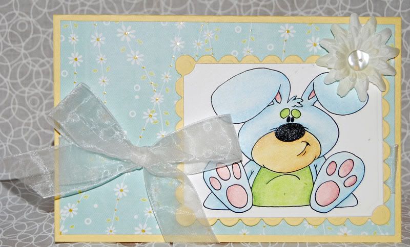
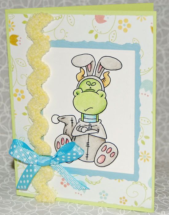
For those of you starting to feel the first itches of Spring Fever, be sure to check out the February Doodle Dragon Studios Membership. Not only is it a great deal, it's loaded with delightful bunnies and chicks to bring out the Spring in even the grumpiest of Polar Bears. One of my favorites is this fat little fellow. I went very non-traditional bunny with him, decking him out in cheerful pastel colors. Inside this bright card is a cheeky “Dye your Hare? I never would have guessed!” Needless to say, the charm is all on the outside.
Speaking of charm, what do you think of this fellow? As soon as I saw him, I knew it was time to do a reprise of my favorite bunny card. Inside, the card says “Don't worry. It's only a grey hare!” Two of my favorite people will be getting these cards. We've been trading such sentiments for years and they know they're sent with just as much love as laughter.
Feeling the need for a bit of Spring in your step? Why not jump over to Dustin's blog and check out the newly revamped challenges. Spring is in the air over there and I look forward to seeing what you produce. I might even catch a bit of Spring Fever browsing everyone's creations.
Supplies this time around came straight from my stash. In this case, from the scrap bin. The patterned papers are a spring line of Imaginisce from three years ago! I still love them and regret I didn't buy extra. If anyone has these papers languishing in their stash, send them on over! I can't get enough of that sweet daisy paper! The cardstock this time around is Prism and my much loved Gina K. Pure Lux base weight for the images. Nestabilities, of course in deckle, scallop and label shapes. The ribbons and rickrack are all from my stash. I lost my LSS a couple years ago, so I've been shopping my office lately for supplies.
Tune in later this week and I'll be sharing my version of Dudley Grows Up! I ran a bit late due to a dead camera battery, but they're definitely worth the share.
Feb 9, 2011
Once upon a time...
I made a card!
Yes, you should be impressed. This is the first crafty thing I've made in nearly a year that didn't require a sewing machine. I've made aprons, started placemats (no, I don't want to talk about it), a collection of burp rags and swaddling blankets along with one totally rockin' Christmas dress for my daughter. That's not saying my pencils have gone neglected. Not by a long shot! I have a fine collection of colored images, including some totally cute monsters and bugs. I have not, however, managed to put them onto a card. I have even managed to add to my collection of pencils, after a couple of trips through the pencil isle at Blick Art store in Chicago. That's a story for another day.
Today's story is all about Princesses. At the heart of the best fairy tales are princesses. Tall princesses, short princesses, and even princesses stuck in towers. Such stories should always end "and they lived happily ever after". I honor of princesses everywhere, along with a few princes and even a gnome or two, Dustin has offered up a fine collection of princesses, even a self-rescuing princess who slays her own dragon. It's the Ever After collection being released on Thursday. You'll want to check it out and take a look at the new, improved Doodle Dragon store!
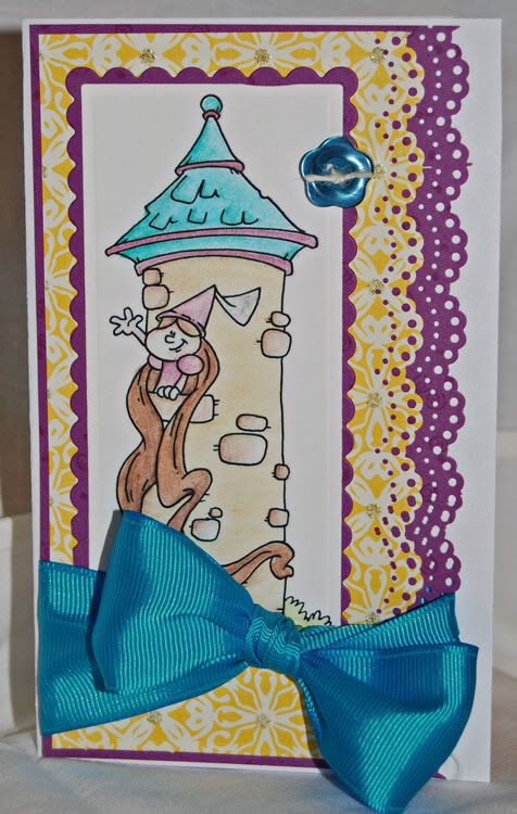
This card is my favorite of the images being released. Growing up, I had two very favorite princess stories. One was a tale called "The Practical Princess", the other was Rapunzel. My take on the long haired girl is considerably less pink than my own princess wanted, but since I was doing the coloring, I got to pick the colors! Given a choice, my princess would be pink, pink and, oh yes, pink.
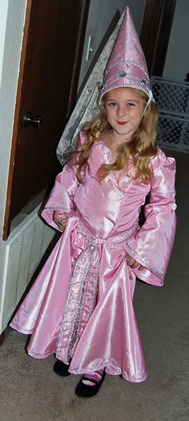
I leave you today with my other princess crafting endeavor in her pretty pink princess costume I made for Halloween. I will say that she's the coolest craft project that I will probably never finish.
Card supplies are shockingly enough, a DCWV stack and a Creative Cafe button. The image was cut with long rectangle Spellbinders nesties dies and backed with scallop rectangle nesties. The lace edge is courtesy of my one and only Martha Stewart edge punch. Coloring was done with Prismacolor and Derwent colored pencils on Gina k's Pure Lux Base-weight cardstock.
Subscribe to:
Posts (Atom)