Now if you've followed me this far and have checked out that first link, you're probably wondering where in heck the baby oil came into play. The original technique tutorial I found used Gamsol or Odorless Mineral Spirits. As my 3 year old daughter will poke her fingers into just about anything and then ask about it, I knew it was a bad idea. After reading several posts about people using Baby Oil instead, I figured it was at least worth a try. Baby oil is essentially just a scented mineral oil, so I don't worry so much about those little fingers. The thought of her getting her fingers in OMS, which is a solvent, makes my heart go pitty pat in not a good way.
That being said, I use a bit of 100% cotton batting well saturated in baby oil in the bottom of a stage 1 baby food jar. The 3 year old has a 11 month old baby brother, so I've got a stock pile of those right now. I can honestly say that I'm thrilled with the results I'm getting. The images don't even look like they've been "penciled". And, not at all to my surprise, my daughter had her fingers in the jar poking at the baby oil soaked batting in nothing flat. There are days when I swear the girl can teleport! She spent a few hours with her hands smelling of baby oil and I was reminded that she can reach considerably farther than I expect on any given day.
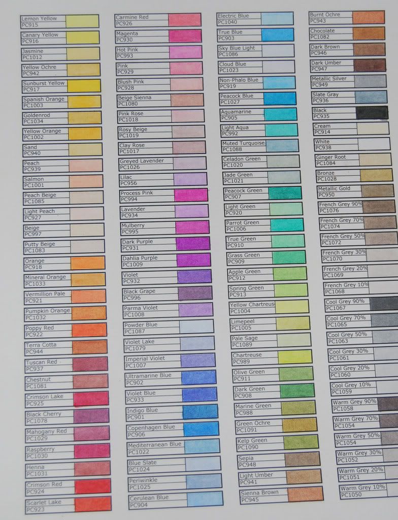
 Let's talk usability. I highly recommend you take the time to sit down and make up a color swatch chart. I invested about a half a day. Keep in mind that I'm working with the restraints of a toddler and a pre-schooler. You can probably accomplish the same thing in half the time. I created the swatch chart in Excel and after a bit of tweaking, printed it off. I used four columns as my pencils are in a tin with four trays. Each column matches a tray, so I can instantly find the color I need.
My prismas did not come in this color order. They came in some order that I'm sure makes perfect sense to Sanford's packing and shipping department. However, they very thoughtfully included an information booklet that had the colors listed in this order. Since this order groups color families and like colors making it easy to pick shading colors, I spent the better part of an hour rearranging.
I sacrificed a sheet of my Gina K Pure Luxury Base Weight cardstock in order to create my chart. I highly recommend you use a sheet of the cardstock for your chart that you will be using for the majority of your coloring. Your chart should reflect the color, tone and blending that you will get when working on a larger project. You'll be tempted to grab a sheet of cheap sacrificial cardstock to make the chart, but seriously, use the good stuff. You'll be happy you did in the long run.
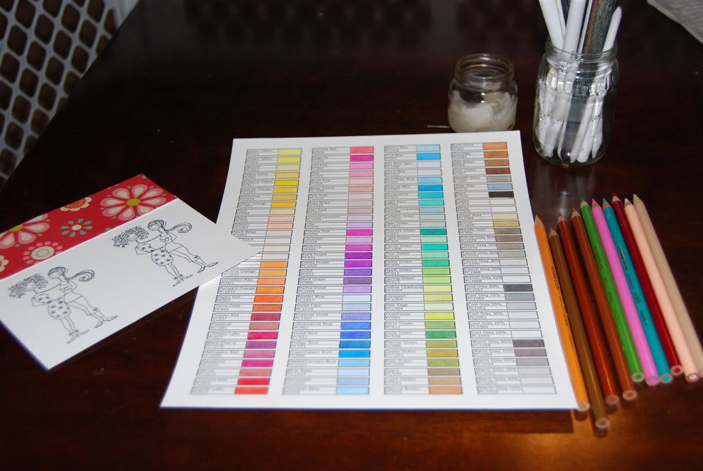
 Here's my setup. I've used my color chart and a piece of paper I'm planning for the card to make color choices for my images.
Application is as simple as pushing the paper "stump" into the cotton batting until it absorbs some of the oil. The batting should be saturated, but you don't need a puddle hanging out around it. Take your time and play with how long you need to poke the batting with the stump to get enough oil to move the color. You can get too much baby oil on the stump and things will get a bit oily. To be honest, I really only have a problem with this when I'm using a lower grade of cardstock for my images. I moved to Gina K's base weight Pure Luxury (my new bestest cardstock ever) and my results increased dramatically with less oil overall.
If you do get too much oil on the stump, give it a rest for a few seconds so the stump has time to absorb the excess. If you're impatient, or the baby is wailing his cute little head off because you decided to blend one small area before you give him a bottle (don't ask me how I know about that, okay? ), give it a quick scrub on your sand paper and try again.
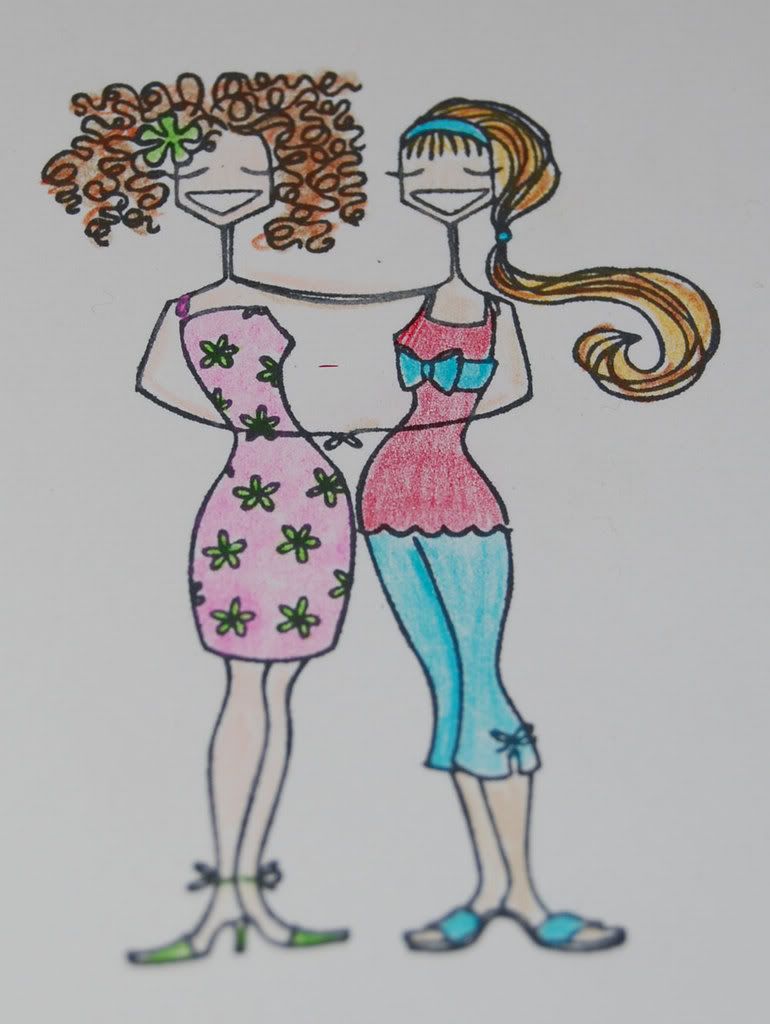
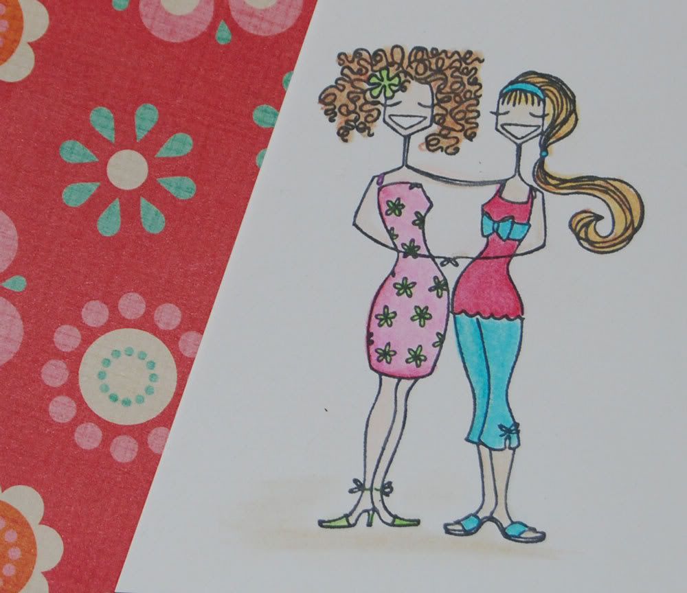
Most tutorials I've found have you laying down a heavy line around the outer edge of the image. I'm not a huge fan of the very light to white centers that this technique gives me. For me, I've found that a light coloring gives me a smooth base to layer and shade on. Additionally, I've found that most of the info sites have you doing just one area at a time. I prefer to do a quick pencil of the entire image and then return to blend and shade. Keep in mind the constraints I'm working under. It's frequently easier for me to do a bit of pencil work on several images while I'm keeping watching on kiddos playing in the yard. Technique and style is often a product of environment. That being the case in my situation, I can easily show you before and after shots of coloring and blending. The left is penciled, the right is blended and shaded. Click for larger on both. The images are Huggybellas from Stamping Bella
 |  |
Final Notes - I'm given to understand that the OMS will produce better results than the baby oil, so if you're comfortable having that around, definitely give it a try. I've been doing some research online trying to find a more eco (and kid) friendly option. I found a product called Zest It! in the UK. It's made, not at all surprisingly, of the oils from orange peel. I haven't ordered any yet as I've been trying to find something a bit more "local". I am very tempted though as their product details include specific information on using it to blend pencils. They've even bottled it in smaller containers as a "pencil blend". VERY tempting.
3 comments:
Hi there,
I found your blog via SCS and popped over for a nosey - and am so glad I did. I've been toying with the idea of buying the prisma's - my watercolouring is shocking but I can handle promarkers just fine so I wondered if I'd find the prisma/baby oil combination easier than the watercolouring. I'm away to add you to my blog roll as I would love to keep up to date with you. This post has been great - your colour chart idea is fab. My chum recently bought prisma's but she's not so hot at Excel, so I think I'll have to make her a chart for hers.
Hey! Just saw your post on some forum or another and was wondering if I could bother you for a blank of your Prismacolor color chart. It looks really awesome and I think it could help me keep my colors straight and in order, and I'm too lazy at the moment to go into excel and create my own XD
Thanks
I like how you created a swatch chart for easy access.
Post a Comment