Isn't he hot? :D Definitely a keeper, my guy!
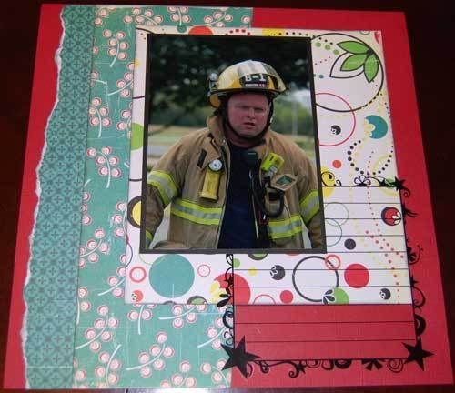
This is as basic as it gets. No title, no embellishments. There's a journaling block, but no journaling yet. I really love the Prima journaling overlays. I'm worried that when I actually write on this one that the bold print behind it is going to cause me problems. I've got some ideas for solutions if it does, but right now I'm hoping to keep it as it is.
My thought process on embellishments - I'm thinking black glitter. I like the bling and the black makes it less girly. I want to keep the circle elements going and pull in a bit more on the stars. I have chipboard stars and I'm well stocked with buttons. The title on this one is already set as is the journaling. The title will be "This Man". I even have the .cut file ready to chop it out. I was just waiting to see where I wanted to go with style and colors. You'll have to check back next week to see this one finished and check out the super sappy journaling. This one was inspired by another Design X challenge. Gosh I love that site! :)
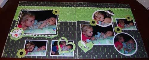
Okay, onto the second layout. This one is actually a bit further along than the other one, but it also has it's own set of challenges. First, the layout ->

First off, I'm not attached to the left/right layout at the moment. I actually built the layout with the two sides reversed, which is how the hearts ended up in the bottom center. I was trying to balance hearts one side to the other and then when I flipped the pages, they ended up in the center. Still balanced, but a different sort of "harmony". I like it just as much that way. I tihnk the title will be the deciding factor on which side will end up where.
I don't typically use patterned paper for the base of my layouts and I very nearly didn't here either. I ended up going with it for a couple of reasons. First, the black cardstock that came with my kit seems more dark grey when I lay stuff on it. Second, I'm short stock on 12x12 black cardstock. Third, well, it just looks good! I was really torn because the back side of this paper is really cute and I had another layout in mind for it. I think my LSS has a few more sheets so if need be, I can get a couple more so I can use the back pattern.
The embellishments are die cuts on top of chipboard. I happened to have the Buck Naked chipboard buttons in my stash and the die cuts listed that they fit right on top. Yay me. :) I tied white ribbon through the buttons to get them a fun 'stitched' down sort of look. The green Bazzill flowers actually match better in person. I'm not sure why they look so olive toned in the picture. I probably need to go in and tweak the contrast a bit.
One item of interest, all of the white photo mats are cut from a single 12x12 sheet of white Bazzill. I really hate wasting white. I don't know why that color bothers me more than others. Maybe because I can use it for journaling or photo mats or small elements. It just drives me nuts to waste. I cut the wallet mats first and then the circles, which left me with a big chunk of cardstock with two holes in it. I was able to easy tuck one hole behind the 5x7 picture, but I still had a 4x6 to mat and not enough "whole" cardstock to do it. I did not want to slice into my remaining piece for one silly photo mat. So I didn't. The 4x6 mat isn't whole. The circle that lays over the top of the picture is actually the circle hole that was causing me the problems. It is laying exactly how it was on the whole sheet. There is a matching scoop in the mat of the photo behind it. I just lined it up with the edges when I stuck it on the page. Voila! No waste! If I had been thinking, I would have cut all the photo mats first and then cut the circles out of them so that they wouldn't show. Ah well, it looks great and no one knows but us, right?
Unlike the layout above, this one doesn't even have a working title and there is no journaling at hand just yet. I can usually pull a title out of my journaling, but this page is just fighting me. Once I decide on the title I've got three options for the lettering. I have two different glitter Thickers, one in white and one in yummy green, I have my Cricut, of course or I have a selection of plain chipboard that I can paint white and stamp with black spots to coordinate. Which one I use will probably have a lot to do with what words I'm using for the title.
The pictures were from early May. Nicholas had only been home for about 3 weeks. She'd gotten over her first impressions with him and decided he was smooch worthy. :) Titles I've tried for this are "Sweet Siblings" and "Sweet Smooches". I'm thinking it's not so "sweet" any longer.
2 comments:
Good luck finishing up your layouts - it was cool reading your process for completing them! I love that Cosmo Cricket line, too - just got some of that myself!
Thanks for postinng this
Post a Comment