Apr 22, 2013

Hop along with me!


Welcome to the Spring Fling Hop-Hop-Hop with Doodle Dragon Crew and Design to Color.  You should have hopped from Lori's blog We are so happy you could join us for this special occasion. It is also Dustin Pikes 4 year Blogaversary.  You wont want to miss out on the deals he is offering.  Some of the crew used images from the new set, so hop around and get inspired.  Don't forget to check out the blogaversary sets on his blog and in the store HERE 


Just images for me today because I'm decorating my office for spring.  I have a pair of simple black frames that I use, simply swapping out the images to match the season.  These two will be hanging over my computer monitor, brightening my days.  They're colored up with Inktense pencils with just a touch of a glitter pen for that little bit of sparkle.


Leaving a comment and some love will get you a chance of winning some cool stuff.   Both Designed to Color and Dustin Pike have some goodies to give away.  Hopping is open until the 25th and winners will be announced by the 29th.  So hop on over to Kerri's blog and check out the sweet creation!  If you have gotten lost here are the hop links below.  Hop along now!!

Jan 15, 2013

I can see clearly now...

Today I'm going to give you a drive by introduction to my favorite graphics program, CorelDRAW Suite. A good 95% or more of the printing, editing and enhancing the graphics I use before I print and color is done in CorelDraw. I have used this program through 12 software updates. Even in computer terms, that's a long time. I first found CorelDraw in version 3 around 1995. I think I got the disk in a CD-ROM multimedia kit. For those of you who remember the early days of CDs, yeah, I'm that sort of old. I am 100% self taught with this program, so what I'm going to show you may not necessary be the easiest way to do things, but it's my way. I think if you'll give the program and its many functions a try, you might find you like it.

In this tutorial, the first of two, we are going to cover converting your .jpg image to a .png type image with a transparent background. This is going to let us tuck the text or even another image behind the image, giving it depth. In the second tutorial, I'll cover using CorelDraw to create a vector image, a swirl to add with text to give the impression that our fine Dudley is an Olympic calibre skater and did some fancy footwork to skate a greeting. I'm using the new SkateDragonB image from Dustin's new release.

Because I have a CorelDraw Suite, it's a package of programs including a program comparable to Adobe Photoshop Elements. Corel's version is called Corel Photo-Paint. In general, the programs are pretty much the same. The tool we'll be using is the magic wand, which functions the same in both programs. I have opened the image in Corel Photo-Paint.


Click on the magic wand tool (small circle) and set the Tolerance at the top to around 5. Don't see the magicwand on your tool bar, the W key on the keyboard turns it on. Type and see! I have four here and that worked really well. Make sure Anti-Alias is turned off. It's the circle with the red line through it next to the tolerance setting (larger oval). This is what it looks like when it's turned on.
On the opposite side of the Photo-Paint window, you have the Objects bar.
You can see our image listed with the name "background". Hover over this and you'll get a little popup that says "background active, opacity 100%", which is Corel's way of telling us what we already knew.
You can't see through this image. To turn opacity off, simply click on the layered boxes to the side of the "Background" title on the layer. Its things like this that make Corel stand out for me. Doing the same thing in Photoshop Elements takes a couple of steps. I prefer the click and go method.

We are now ready to do away with the white background. Using the magic wand, click on the white background area of the Dudley image. You will see what is commonly refered to the "marching ants" appear around the white area.
Press the DELETE key and the white drops away to be replaced with a white and grey checkerboard pattern. Where ever you see this checkerboard image, that portion of the image is now transparent.


Scroll around the image and look for areas that are not connected to the main background image, but are areas where you want the image to be transparent, like between the blade areas on the skate and that spot under Dudley's arm, just above his tail, or even the loop in the skated scroll.

When you have all the little fiddly areas cleared of white background, it's time to save the image. If you do a straight save and keep the image as a .jpg, the original format you snagged from the Doodle Dragon Studios site, you have just taken all your efforts and chunked them out the window.  The .jpg format does not allow for transparent images, so we'll need to convert this image to a format that does allow for them.  In this case, .PNG is the way to go. 


Under File, choose the option for Save As.

The save as box has a drop down list of all the available image formats you can use. Select PNG - Portable Network Graphics and click Save.
You may see a prompt that Objects will be merged with the background. That's fine. click OK.

The Export to PNG window will come up next. For the most part, the default settings are what you want. The main thing to look for here is the "Transparency" checkbox under Settings on the right. Make sure there is a check in the box. Click Okay and you have a transparent image ready for layering!

Next up, we'll talk about the CorelDraw program in the suite and create a simple vector graphic to combine with our now transparent Dudley.

Think you may want to give Corel a try? Corel offers a free trial on their site and you can get the Home and Student version of the software can be picked up on Amazon for under $60.

Dec 2, 2012

Going Green

And red!  Green and Red are the challenge up at Doodle Dragon Studios this time around.  I have to admit that while I love green and red, wearing them frequently, I don't intermingle them.  Red and green together simple are not my color wave so this was particularly challenging for me.  So much so that I didn't color these images.  (Gasp!)  I know! 


Charming, right?  I have a fondness for flamingos and once decorated a friends new trailer house yard with a liberal application of them while he was away on his honeymoon.  Because that is the sort of friend I am. 

 This paper is part of a quite old Christmas collection by Debbie Mumm with a liberal application of black ink around the edges.  I think I may have been a bit distressed by the color choices so went a bit overboard on distressing the paper.  The Joy is cut with my Cricut using Opposites Attract cartridge.

While I was hunting down the flamingos (these images have been around for quite a while, so it took some looking!), I came across this fine gentleman.
 
 I have to believe this is how the big man is getting gifts to our troops over seas!  Isn't he perfect with this red and green striped paper?  I haven't a clue where this paper is from as I just had one card sized scrap tucked near the bottom of my scrap bin.  To be honest, I don't remember buying a sheet of this as I have that whole red and green thing.  Best guess is that is is a left over from a group card making project with friends.

And finally, having been overcome by the whole red and green thing, I drifted towards more comfortable colors.  My reds went pink and my greens went a bit on the minty side.  It suited this charming Santa and his "reindeer" don't you think?


I discovered an alarming bit of business when I went to photograph this card.  For all it's charm, it is assembled upside down.  Which means that if you were receive this card from me and in delight, perch it in a place of honor upon your mantle piece, it would sit like so:


 Fortunately for me, I have the perfect friend to send this to.  I'm sure she will appreciate the humor behind an upside down flamingo Santa.

Go forth and craft, people.  Remember you MUST use a Doodle Dragon Studios image and be done up in shades of red and green.  Be sure to stroll past the rest of the design team and check out their cards.  They'll be more red and green than pink and mint, I promise!

Jun 17, 2012

All Tied Up

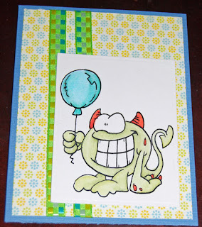
This week's challenge over on the Doodle Dragon Studios blog is ribbon! I love ribbon and use it on just about everything. There is even a massive box of it tucked away for use whenever I feel the need. In this case, I toned things down. The card was destined for a boy on his birthday. The oldest of the cousins in the area turned 7. I let the girl bug pick the image from a stack of completed ones I keep in my card bin. I should have stopped and taken a photo of the inside once she was done drawing in it. She added a dinosaur and a ton of hearts.

The paper is of course, die cuts with a view. This is from the Citrus stack. I've used so much of that, but I still have tons. It is amazing how far those stacks go! Ribbon was some from my stash, picked up at Hobby Lobby. Rectangle nestabilities finish off the card.

Apr 24, 2011

Does this post make my butt look big?

Float awayOr maybe its just these cards!

I want to thank everyone who posted such lovely comments on my blog. I do hope you'll come back and visit me some time. Winners of the hop will be posted on Dustin's blog very soon now. While you're waiting, I have a couple more hippos to share with you. I will say that Dustin's dragons are my all time favorite of images, but these darling hippos have quickly found their way into at least the top three. If you're new to my blog, let me say that I am a devoted pencilist. Until very recently, Prismacolors held my heart, coming in as my number one coloring choice. All that changed when the hubs rocked Valentine's day this year. He gifted me with the complete set of Derwent Inktense pencils. I am in love! These darling hippos were done entirely with the Inktense pencils.

Bikini GirlDerwent says about them "Pen and ink offers strong, intense colour combined with a translucent effect. Now you can enjoy these distinctive qualities in an easy to use pencil. Inktense has a highly blendable texture and comes in a range of 71 jewel-like colours, plus a non-soluble outliner which allows you to draw outlines that are permanent, even when water is applied. Apply pure, vibrant dry colour then wash the pigment out completely to leave an ink-like effect. Once dry, the colour is permanent and can be worked over with other media. The possibilities are endless, the results stunning." I say, "these pencils totally rock". Mine is a bit shorter than theirs, although, there's has a lot of good things to say about these awesome pencils.

Silly DogI will say that the greatest impact comes when using a wet brush. The colors seem to leap off the page to give you a big vibrant kiss of color. That being said, these pencils are also amazing when used with Zest-It as I have done here. For someone who thought that 132 colors could not possibly be enough variety, I've been incredibly content with a mere 71 colors. Not that I wouldn't be opposed to a few extra colors here and there. I highly recommend giving these pencils a try. I got mine at Dick Blick, as they seem to have the best price around for the set. I paired them with a nice Global leather case made for 72 pencils. These pencils are chunkier than your standard prismacolors. While they do fit in the case, they are seriously snug for the first five or so uses of pulling the pencils in and out. After that the leather and elastic relax a bit and they're easier to get in and out.

Project SuppliesA quick run down of supplies here. Obviously, Derwent Inktense pencils for the coloring. They done on my favorite Gina K. Pure Lux cardstock in base weight. I'm continuing to shop my stash for patterned paper and cardstock. The first card was done with the Citrus Die Cuts with a View stack, the other two are done with My Minds Eye Bloom and Grow collections. I believe both are from the Bloom side. Expect more stash shopping from me in months to come. I've got such a huge stash of papers that it seems silly to buy new! I'm learning to be frugal with my supplies for a change. Not to mention no local store to browse through!